screenshot of bio-bak landing page.
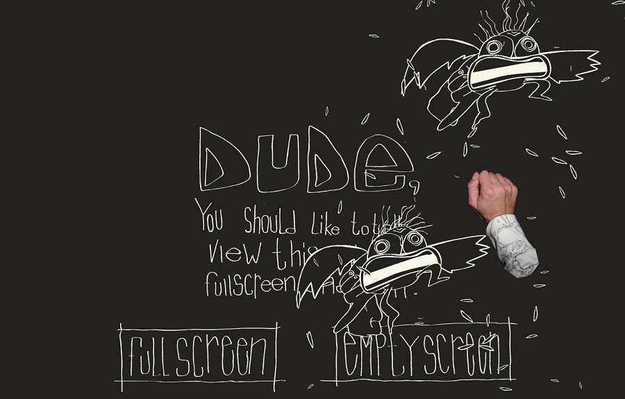
Bio-Bak by Coen Grit: Interactive website which forces the audience to actually engage with the artist’s work. Doubles (eventually) as a portfolio. The walkthrough at the beginning is super fun, not boring at all (unlike some games)
screenshot of bio-bak landing page.
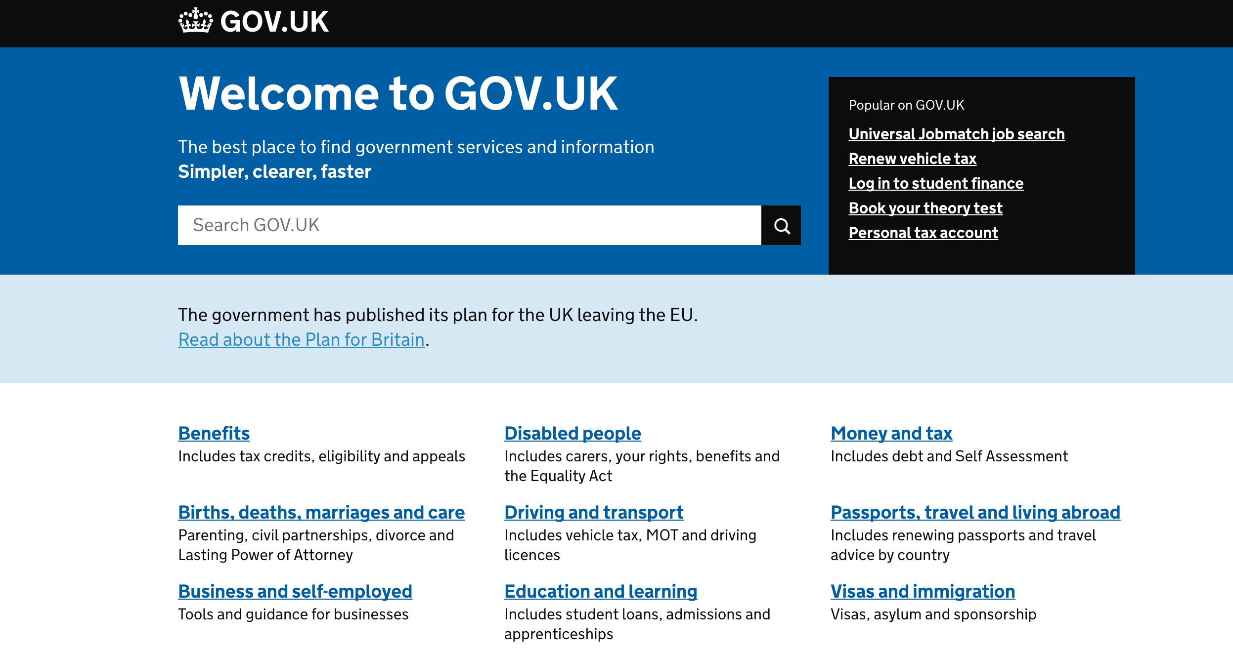
Gov.uk: The official government webpage of the United Kingdom. One of the best/cleanest/easiest to navigate interfaces I’ve ever seen for a government site. I just checked the interface of the American/Canadian/Japanese/Taiwanese official gov’t websites, they’re actually better than I remember but get really clunky when you navigate away from the homepage. The gov.uk site is clean and consistent throughout. (State/Provincial/local-level government web pages are a joke and generally consistently bad)
adult swim: The adult swim homepage is pretty normal now (still looks pretty cool) but during special occasions will have really interesting designs. I enjoy the more experimental etcetra section, which is more sloppy and reminds me of old school net art.
Progressive and Accessible: two tumblr themes designed with accessibility/disabled people in mind. The interpretation of what to/what not to include is quite interesting here, with progressive being the more neutral one of the two and accessible has a lot of options to choose from as the blog owner. The interesting thing to me is that both have the option for the user to change options as needed, but usually another person would be the one to look at the blog--which is why I was thinking whether or not it would make sense to have options on the blog so someone could toggle, say, between font sizes or dyslexia-friendly font (weighted at the bottom).
The interesting thing about the accessible theme is that it also includes mental illness/invisible disabilities and makes it present in the form of an energy counter the blog owner can choose to make visible and change so people online can see the energy levels.
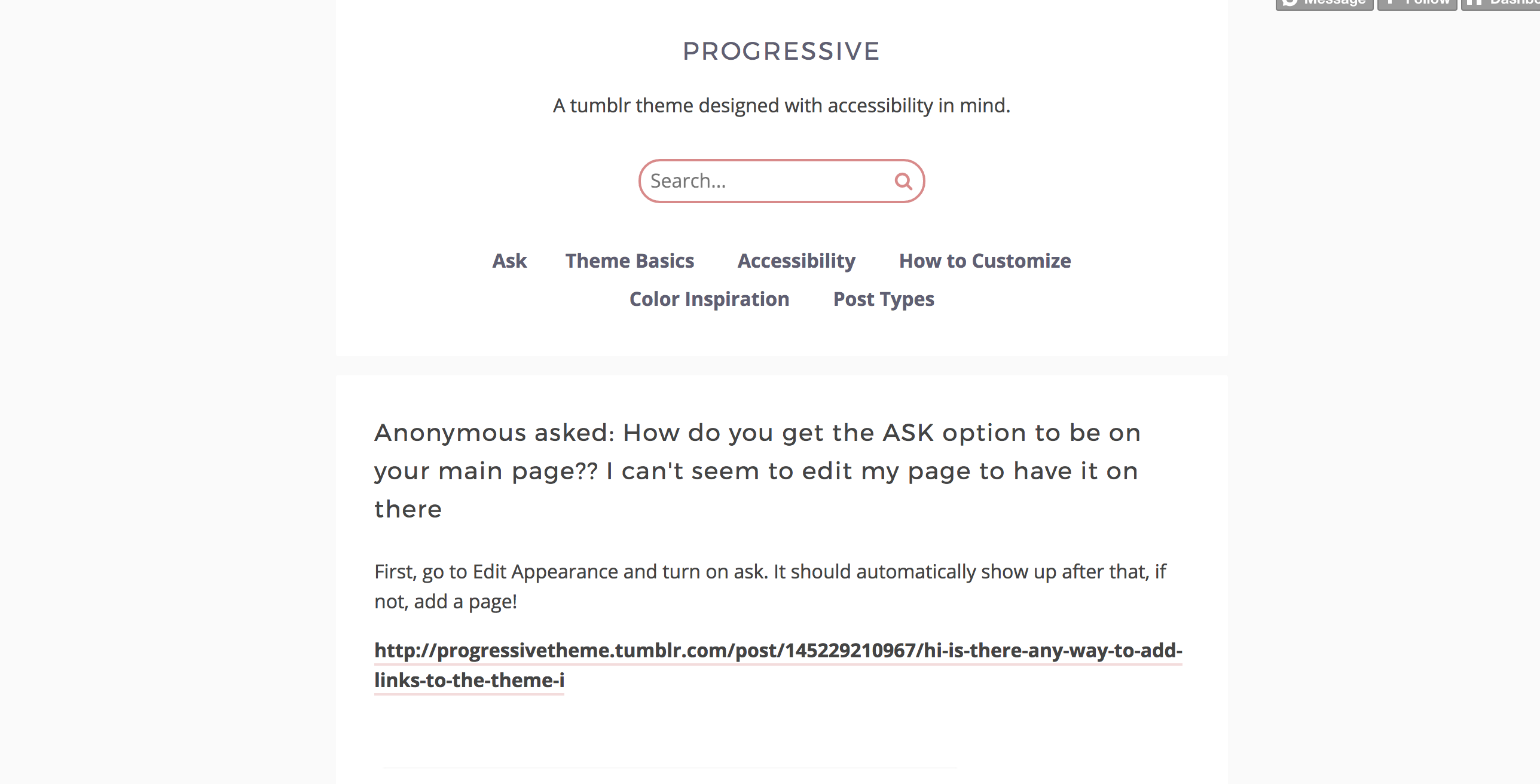 Screenshot of Progressive
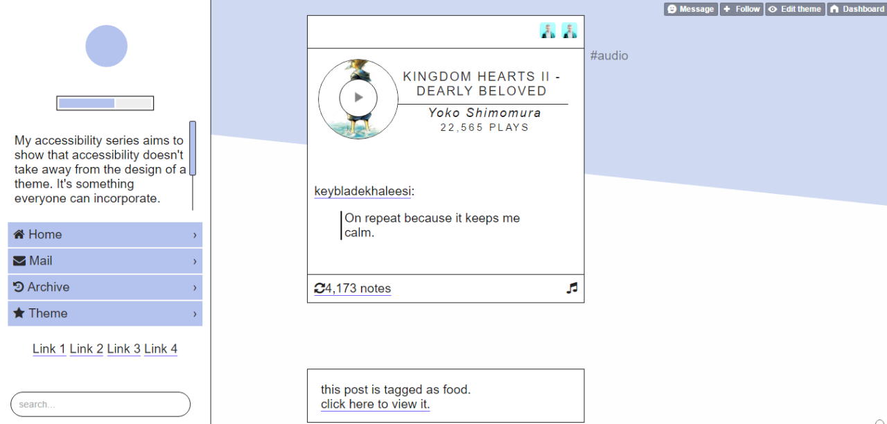 Screenshot of Accessible
Sitemap:
Landing page, with links to work (Twine, processing sketch, 3D, resume/about.) You can go back to the landing page at any time, and there would be a sidebar/top navigation to the different sections.