1. Internet Ugly Image
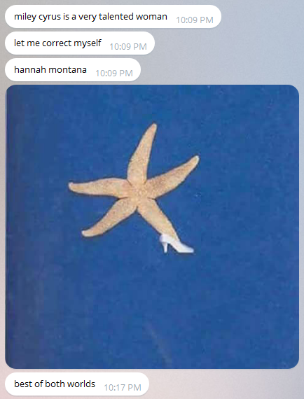
This image was found on tumblr. It can be considered to be "ugly" under the description put forth in the Lialina reading. It's been compressed and resize from a lower quality image, as shown by the pixellation. The content, rather than the aesthetics, is paramount to the humor in this. True to the disposable nature of such content, I actually cannot find the specific post and caption, though I think the context was "my friend is super high and texting me".
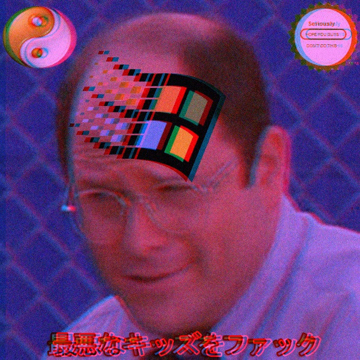
2. "Beautiful" Image

This image was pulled off of imgur, a popular image hosting site. It doubles as a forum as people can vote on images and can comment/start discussions about an image/set of images. I have seen this image multiple times, on tumblr and on reddit, where it has been shared many times. A popular comment was that this was "the highest quality gif" that a user had ever seen. I chose this image to represent an internet "beautiful" image, as it's fairly high quality and aesthetically pleasing/well composed, though I've also seen low-quality versions of it due to the nature of internet sharing.
3. Bonus: Mixed Aesthetic; The Third Wave of the Internet Image?
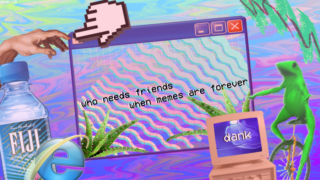
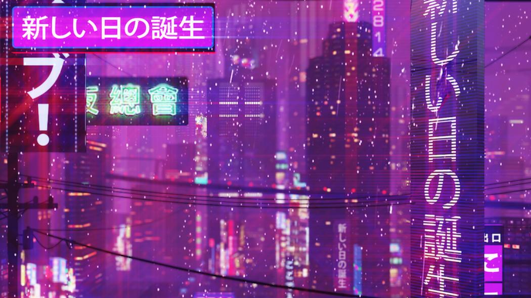
I've noticed a trend arising recently of a third aesthetic which combines elements of internet "ugly" (sloppy image/glitch art) and "beauty" (considered composition, higher quality image). It often co-opts elements of many elements of internet image, such as deliberately glitched/pixellated images, photoshopped collage, ultimately meaningless language (Japanese, Chinese are common but English will occur as well), and juxtapose pop culture references with elements of Classical art history images such as Michaelangelo's sculpture of David. The aesthetic may also incorporate blocky/lo-poly looking animation, reminiscent of early 3D CG work.