No Ceilings: Data Visualization Examples
Weekly Seven | May 10, 2018
1. Women in the Labor Force
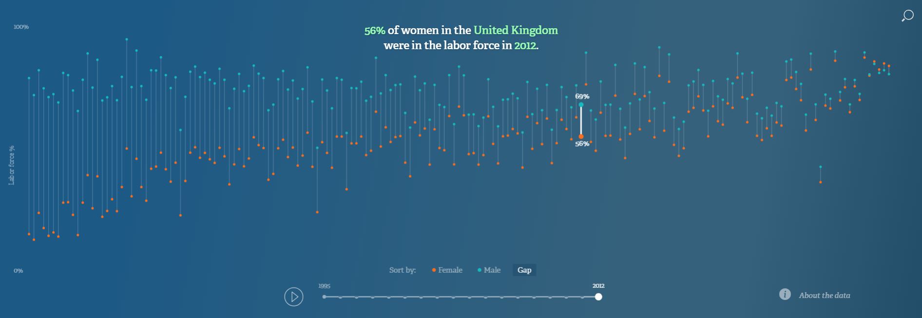
As a whole, this data visualization did a fantastic job relating the visual interaction with the topic. The animating vertical data really highlight the "gap" present between males and females through time.
- I can tell that there is a reliable source for this data. On the bottom right corner, there is a clickable link to open up for more info about the data and where it is from. This source described is very detailed, and includes even more hyperlinks to the original sources.
- I think the color used was a sufficient enough to contrast the male and female comparison, but I do wish that it was possible to enlarge the graph, because the dots and text is just too small.
- I really enjoy the feature that allows you to let it graph animate versus manually changing the time; the animation adds another dimension to to the data.
- The search bar is a nice thing to have so you can search up any country, without needing to click through everything.
- I think it's clever to visualize male and female labor force differences by connecting the two data, it accentuates the "push and pull."
- The order of how these countries were listed seems a bit unpurposeful, and I can't tell why they listed them in the order they are.
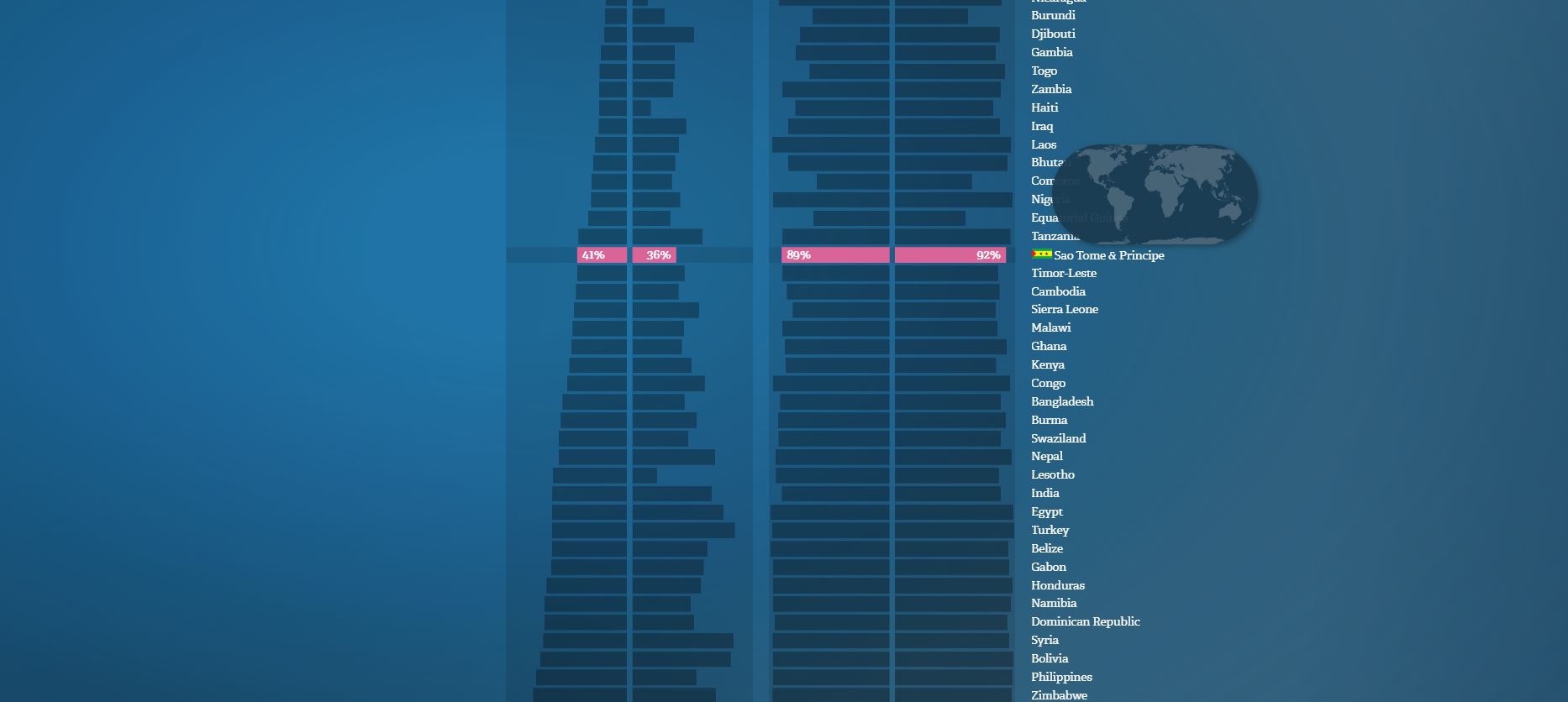
2. Girls From Low-Income Families Receive the Least Schooling
I thought that this was an interesting subject and that the data visualization chosen did a very clean, straightforward job of delivering the info. It is clear to me that the data is making a statement about the difference in education that girls from low-income families are able to access, compared to kids from high-income families and boys in general.
- I like the delay in the mouse-hover interaction on the bar graph.
- The adjacent bar graph comparison works really well, especially since all four bar charts gets highlighted a different color when you hover over.
- I wish the labels for each of the columns were sticky, so I know which bar chart is for which category no matter where I scroll down to.
- I think the type and color palette is fitting with their whole website theme. All the infographics seem pretty consistent when it comes to the graphic themes.
- I like how the subtitle changes depending on which country you hover over, but I'm not able to see the subtitle if I scroll down, so it seems sort of useless.
- I like that when you hover over the location ion next to the country name, a global map with the country highlighted pops up.