references
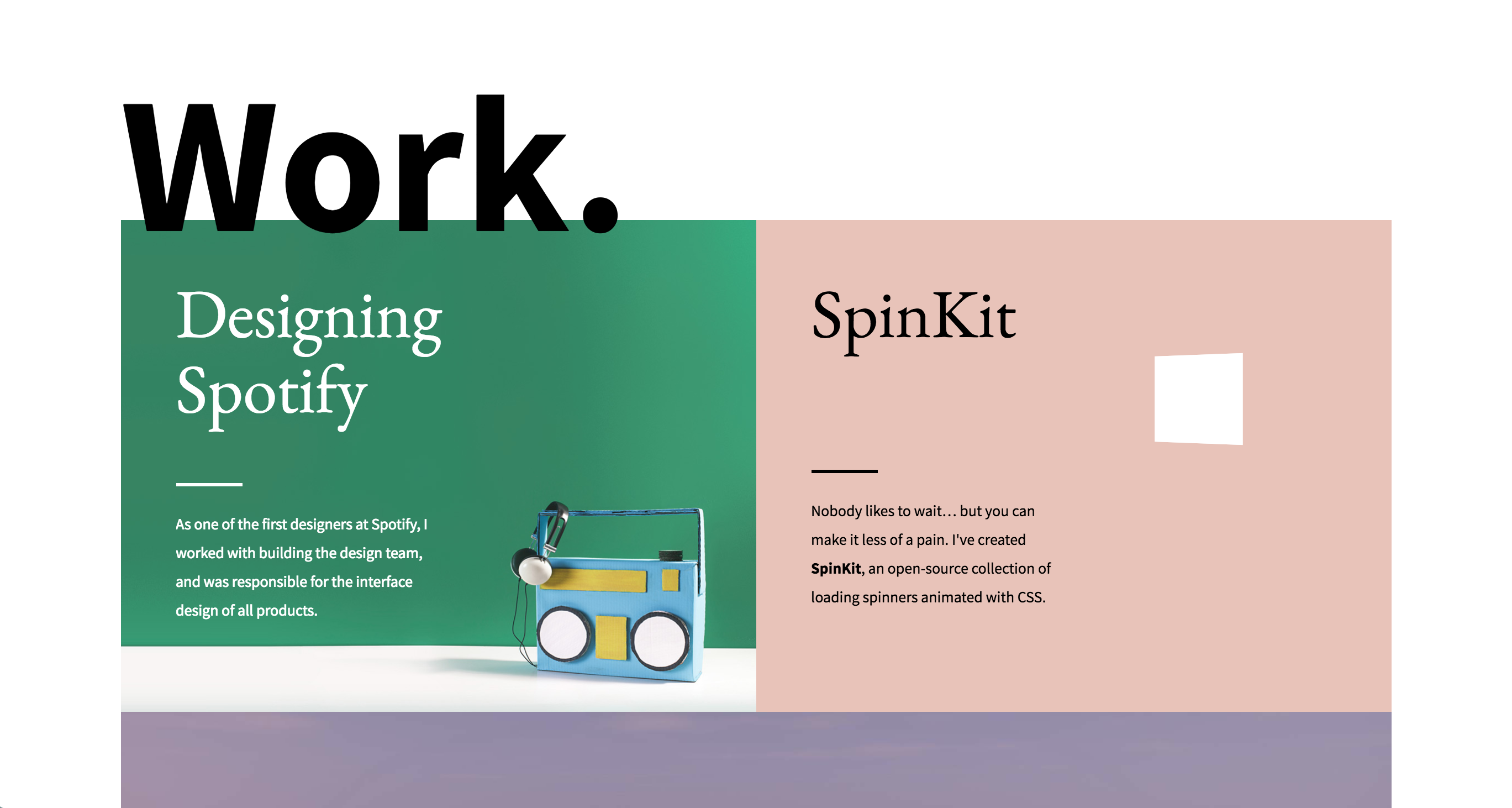
My first reference is from Tobias Ahlin. His concept has a single main page image for each of his works with some text overlay indicating the title and what the project is. I like it because it gives a strong first impression for each work and still allows the images to be large without making them overwhelming/full screen. I also like the slight bit of motion when you roll over the different elements.
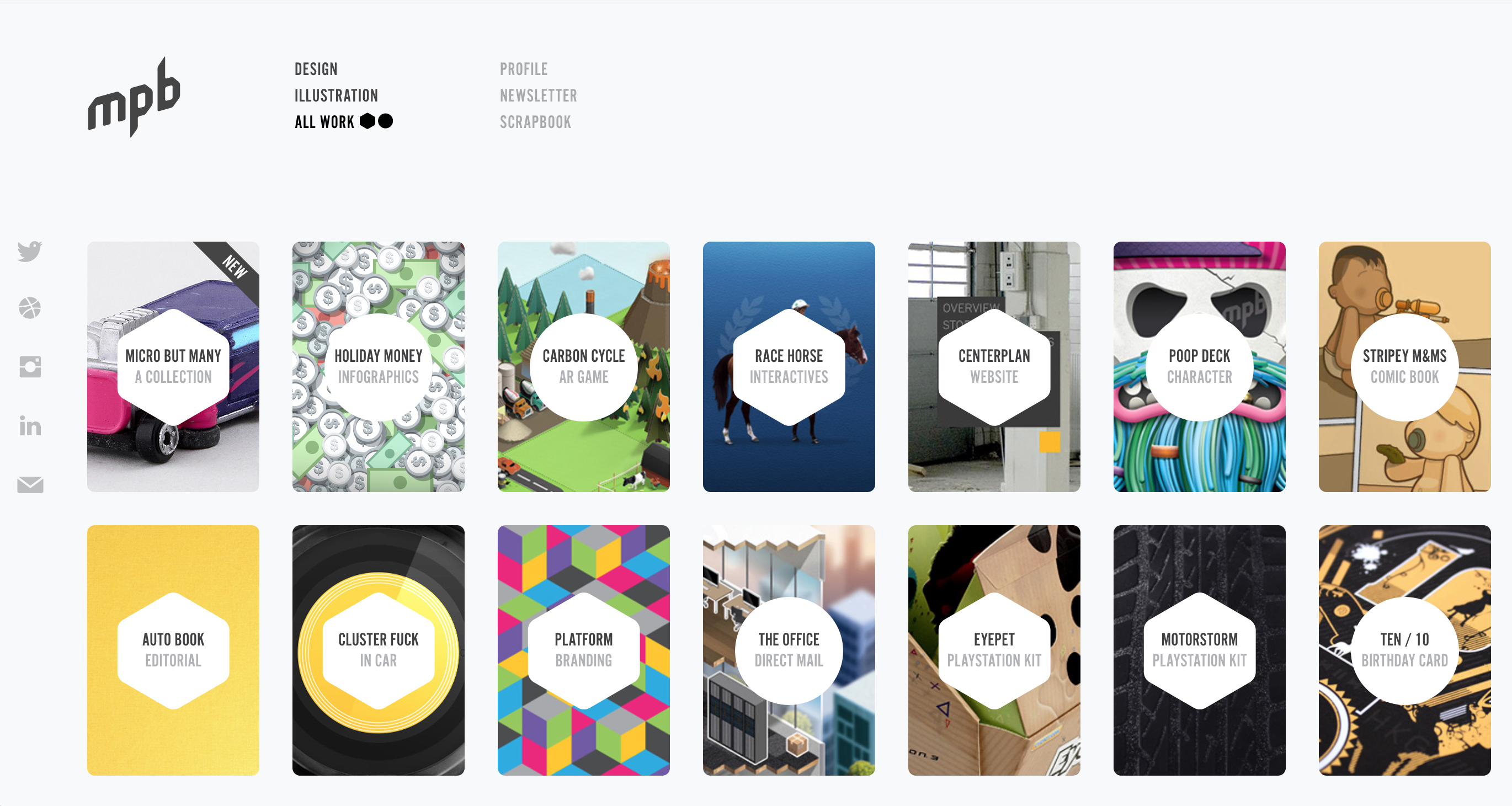
My second reference is My Poor Brain. The site uses little card-shaped images for each of the projects and an interactive shape over the top that states the title and category. I like this one because it displays many projects on the page at once in a neat manner and helps quickly illustrate the variety in the body of works. Like the last one, I also like the small addition of motion when you roll over a project.
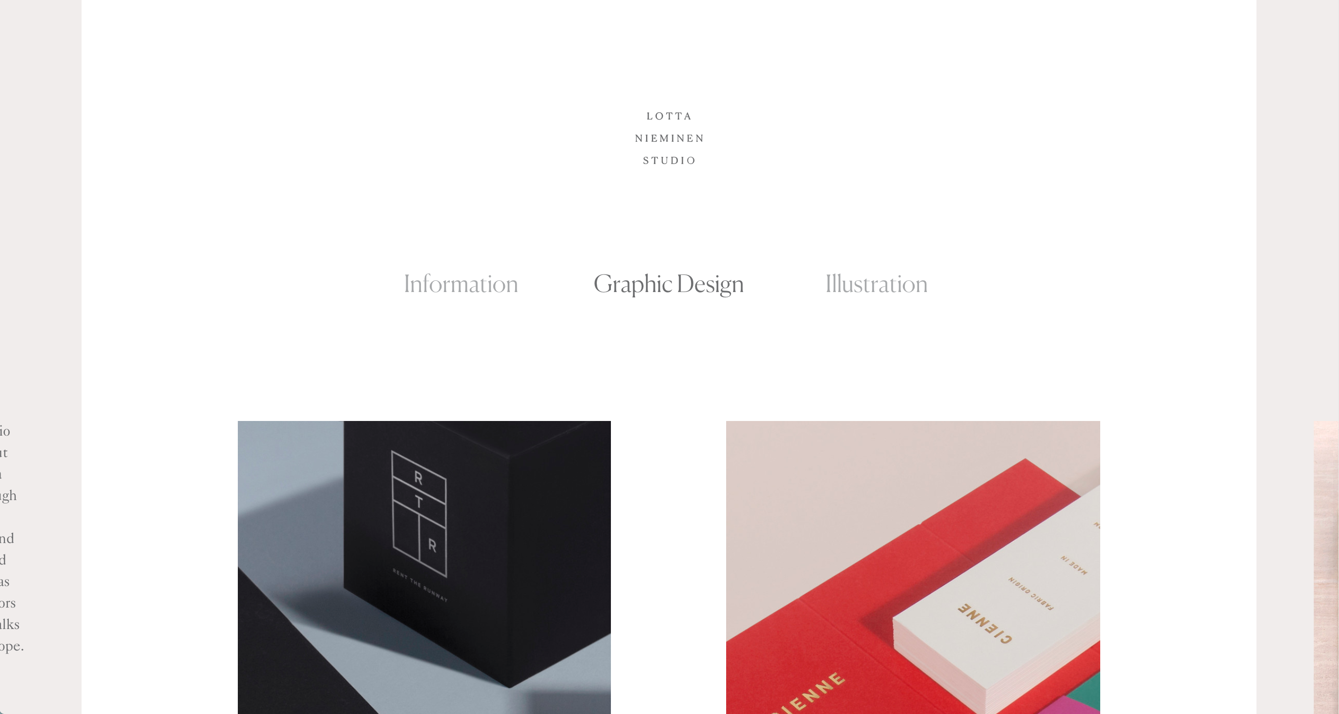
My third reference is Lotta Nieminen's website. Her layout is rather minimal, but she makes her design more creative by making the switch between pages possible by clicking the spill over on the sides of the page. I like her use of fonts and the focus on the images of her work rather than on text.
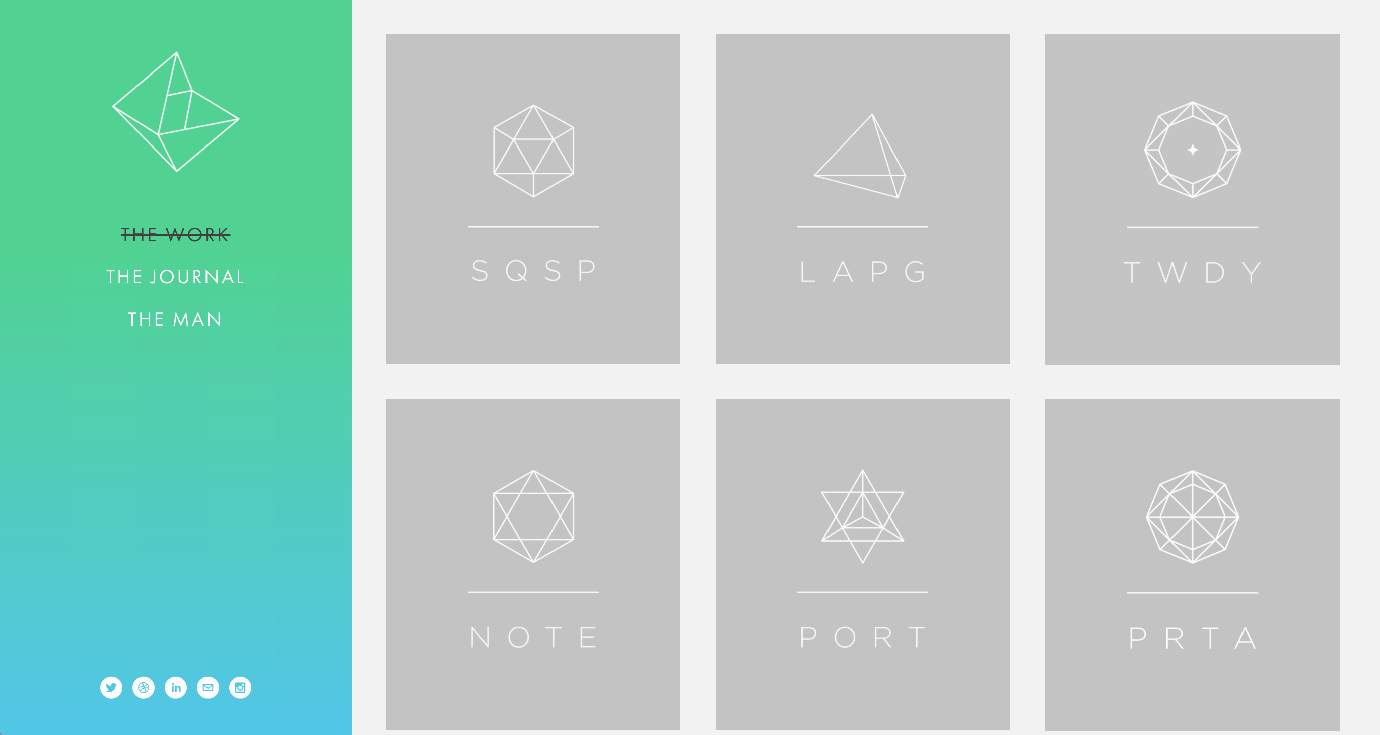
Last but not least, my final reference is Neue York. He created geometric icons and abbreviations for each of his works and also has a color-changing gradient sidebar. I like how cohesive the main page of the website looks due to the lack of images of the specific projects and how clean the layout is in general.