
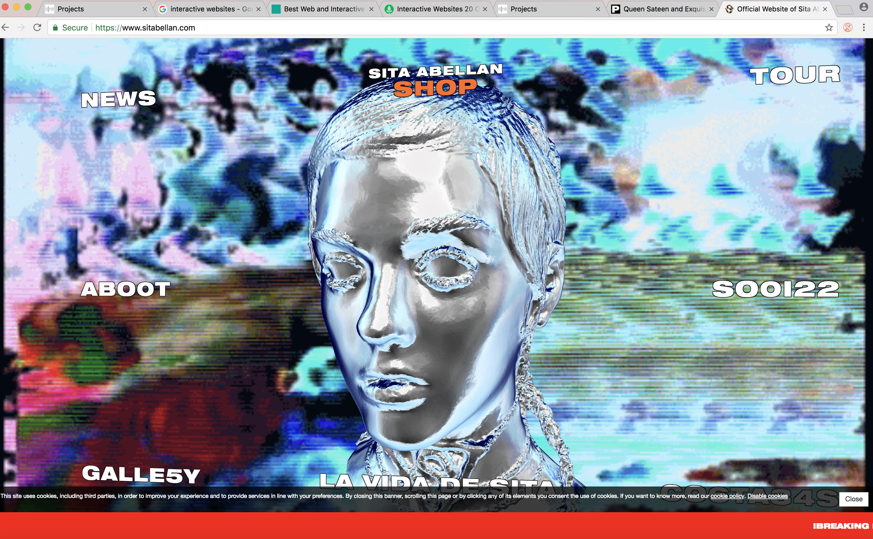
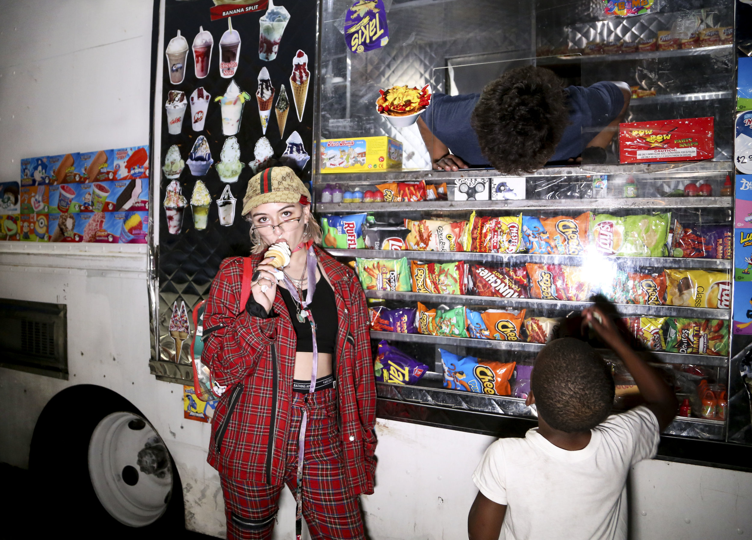
Chaotic Internet Y2K
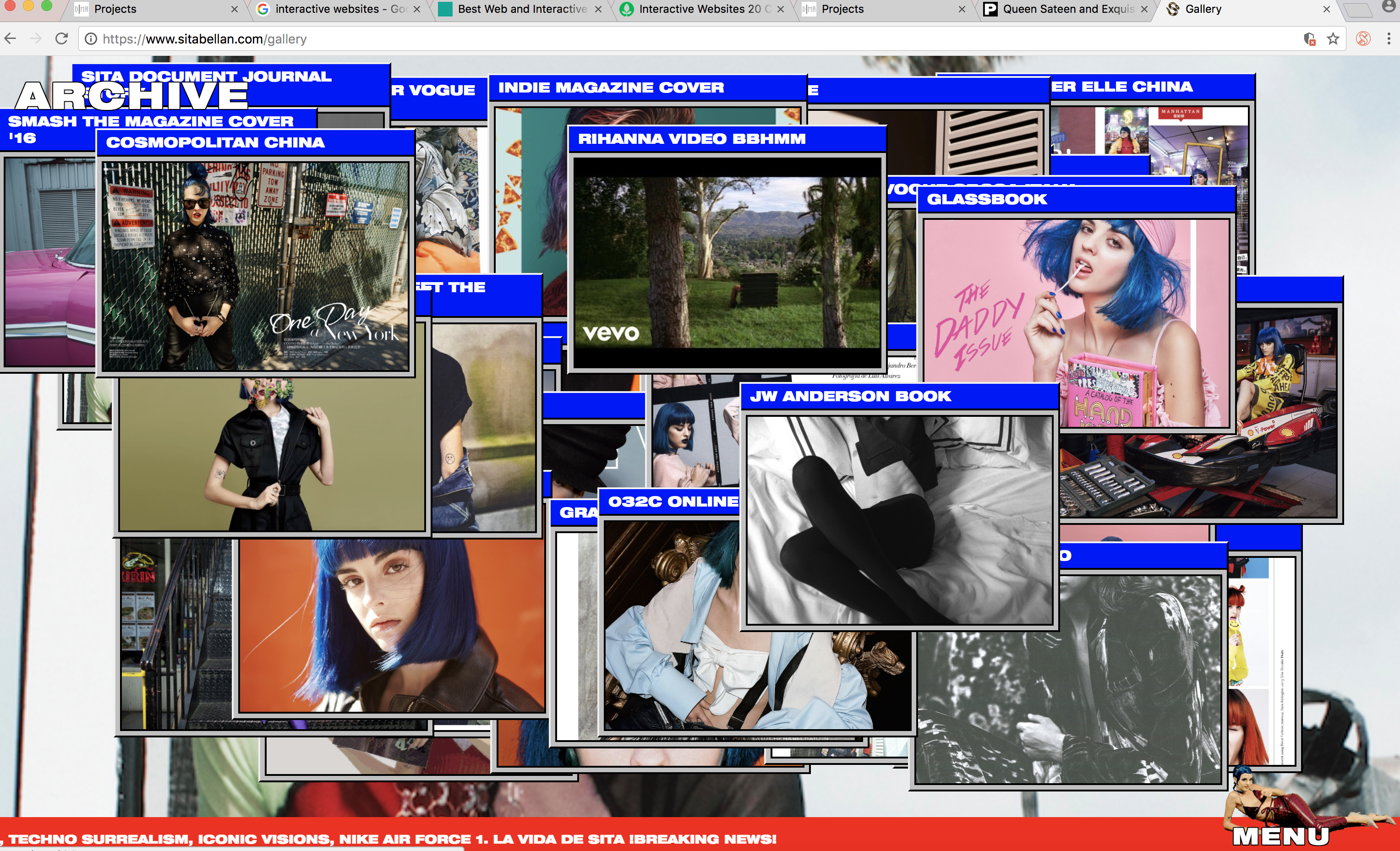
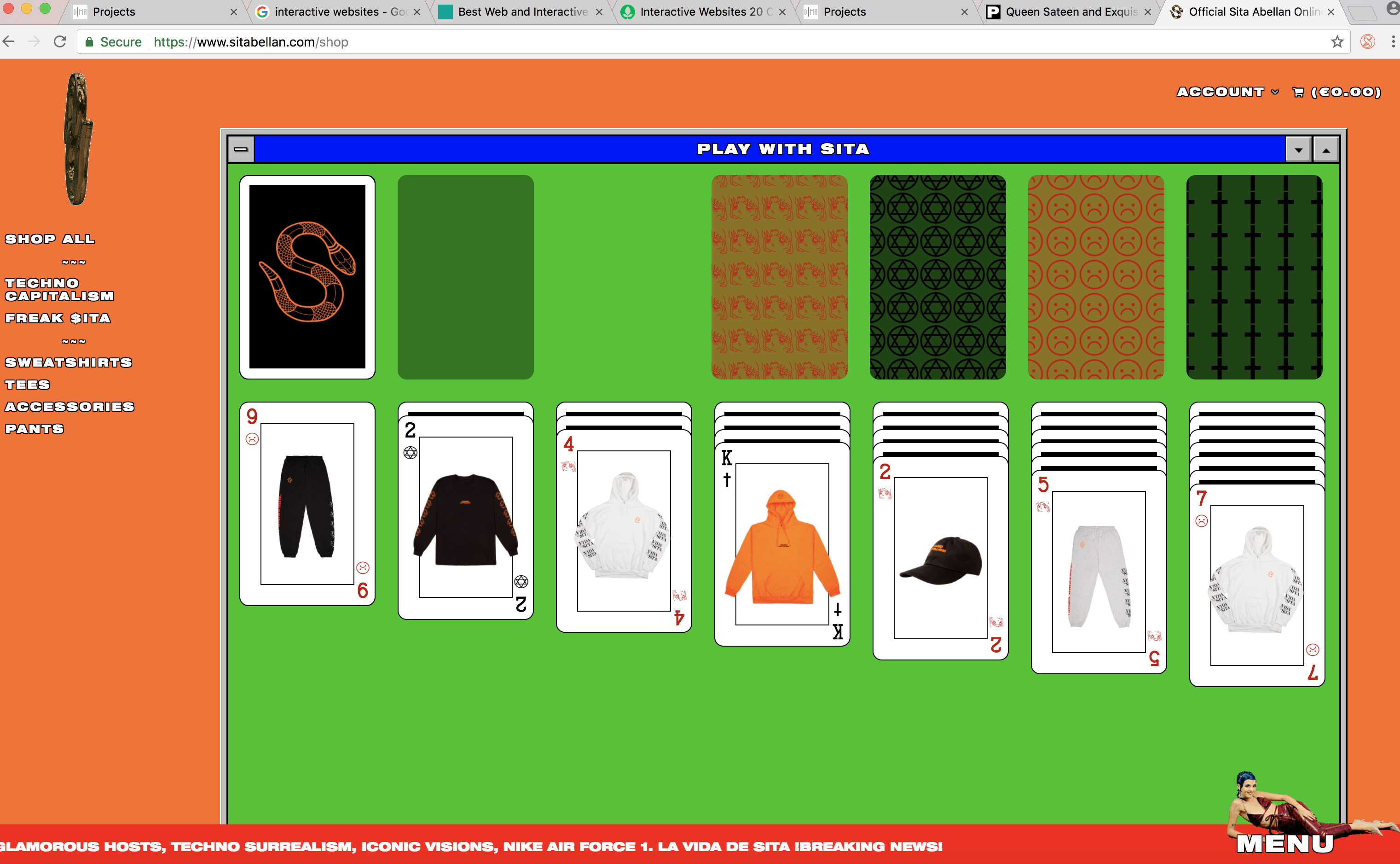
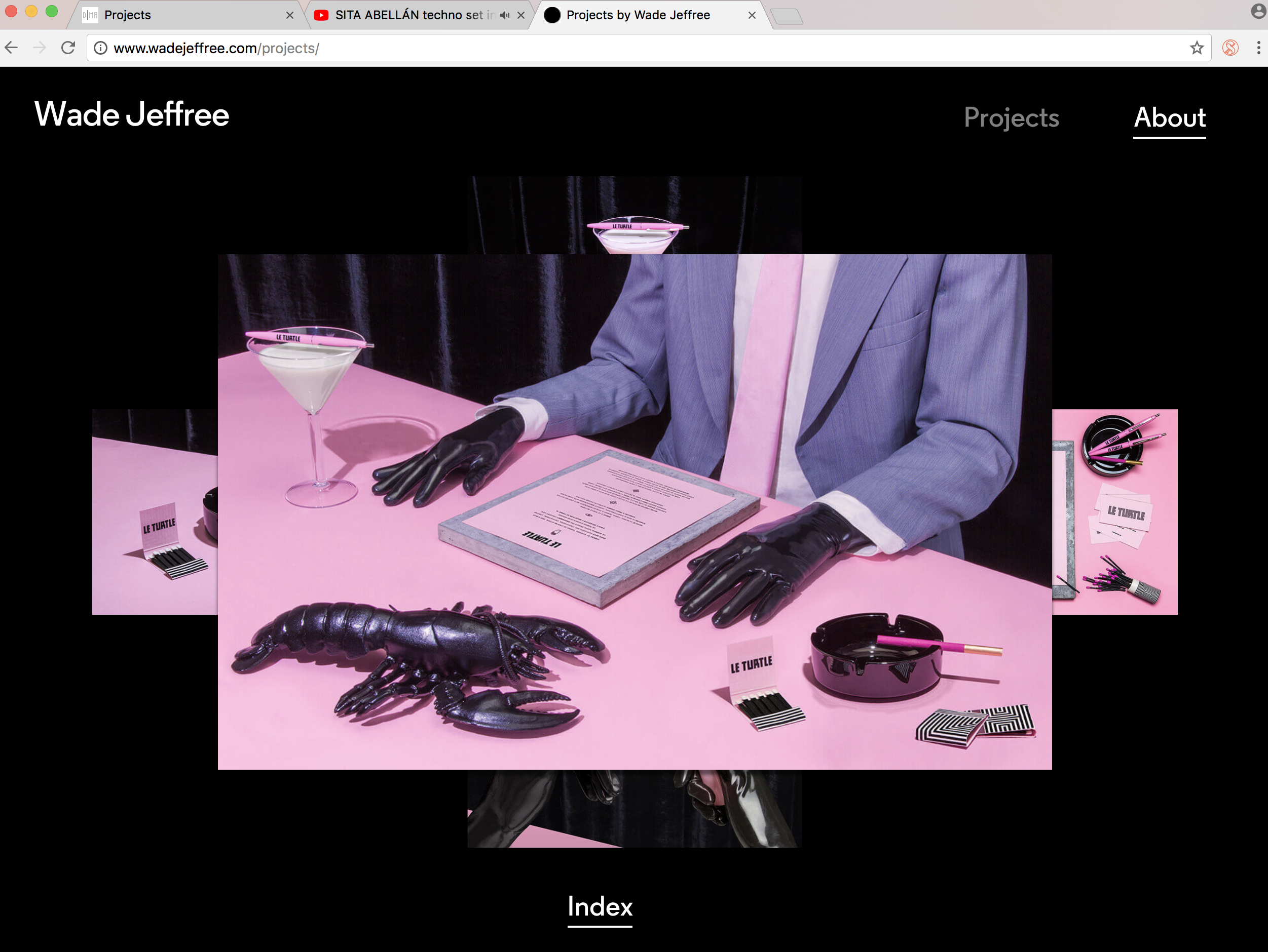
Most of Sita's website is interactive even for something as boring as a merch store, which she made a little game of Solitaire.I really like how she showcased all of her work in new browser tabs that can be dragged around and moved or clicked on to get a further description
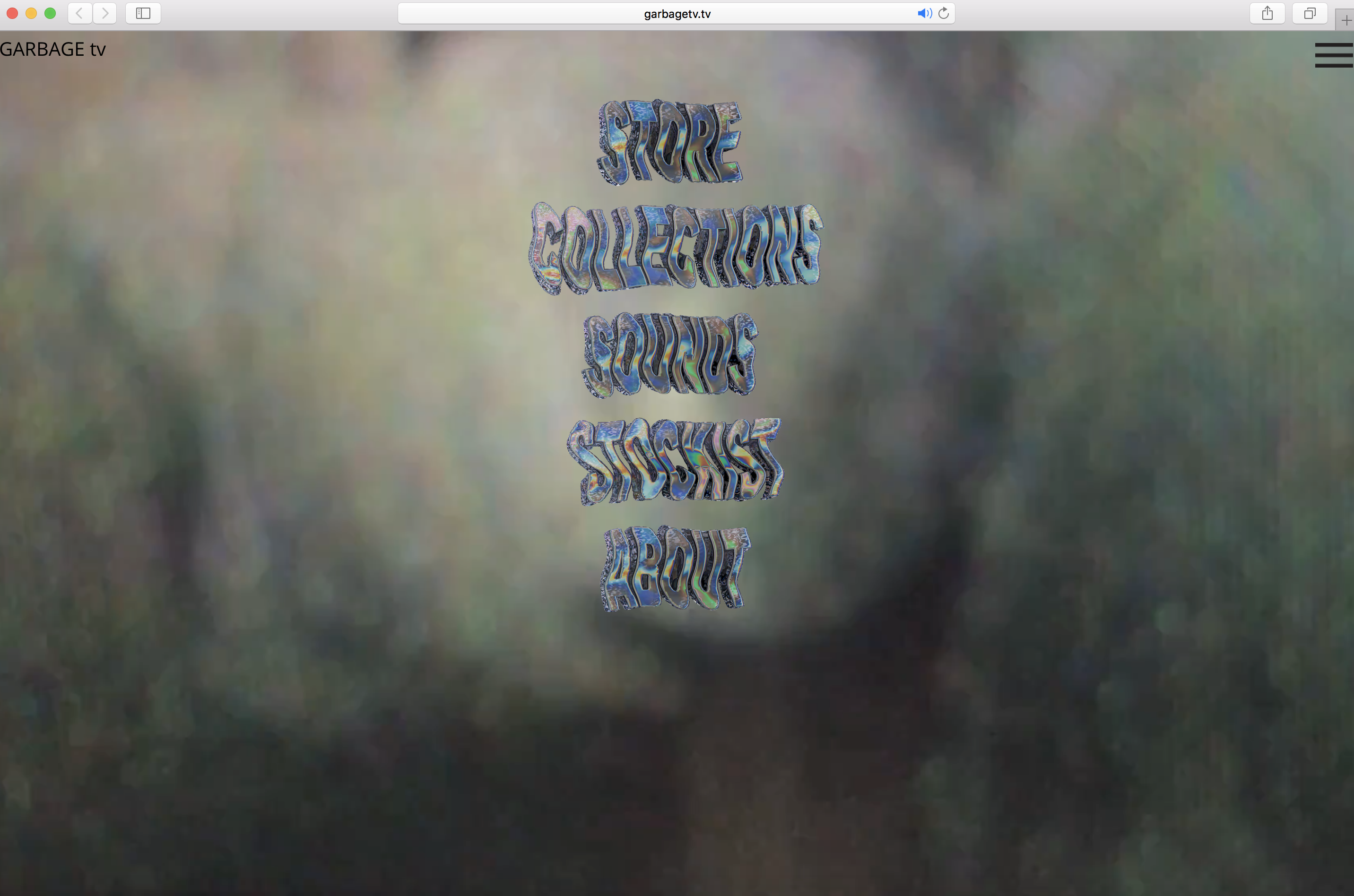
Trippy trash, VHS Y2K
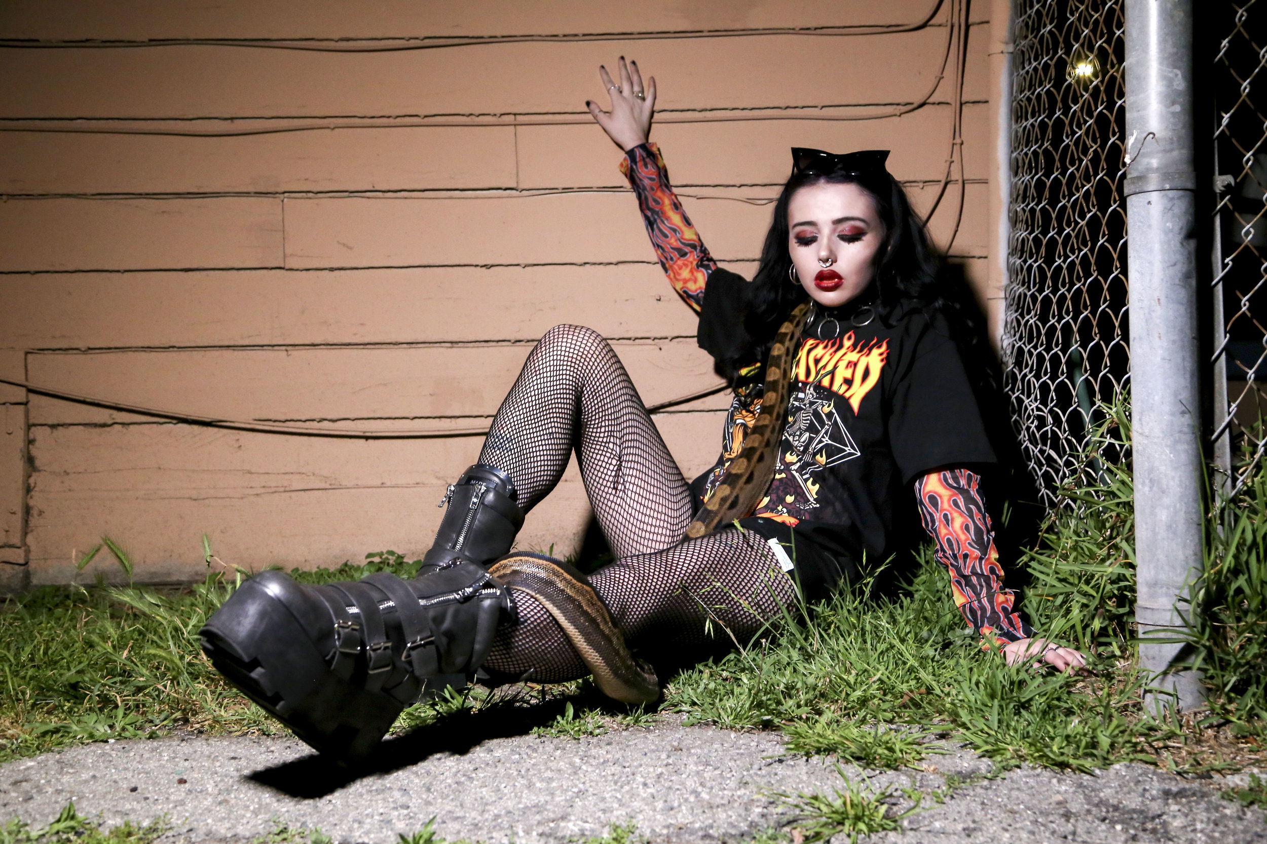
The website feels like it was made by young punk kids who are into all types of art, which is the audience they are targeting.It has that internet surreal feeling mixed with dark punk
Minimal with surreal unsettling elements
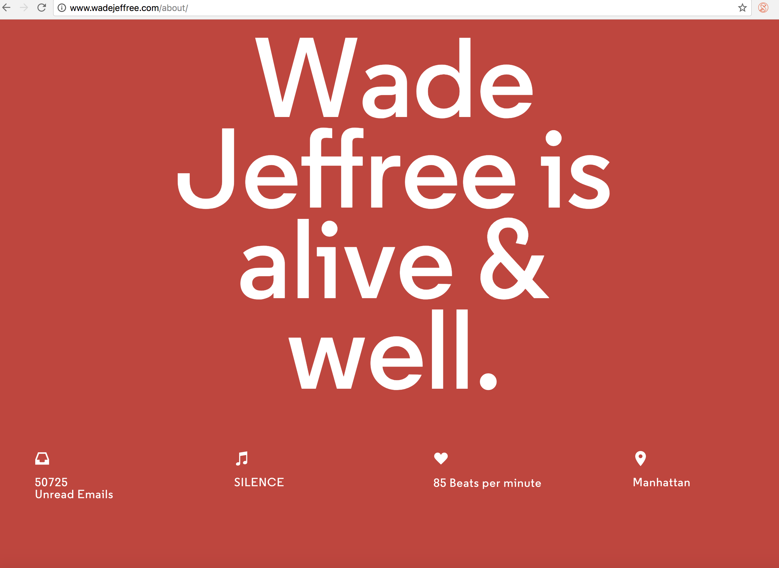
My favorite part of Wade's portfolio was how he too stacked images in a set on top of each other that can be revealed by hovering over them. I also really liked the personal aspect of it that he added by using his wristwatch to update the website with his location, heart rate, music he is listening to and amount of unread details. That was a very cool element.
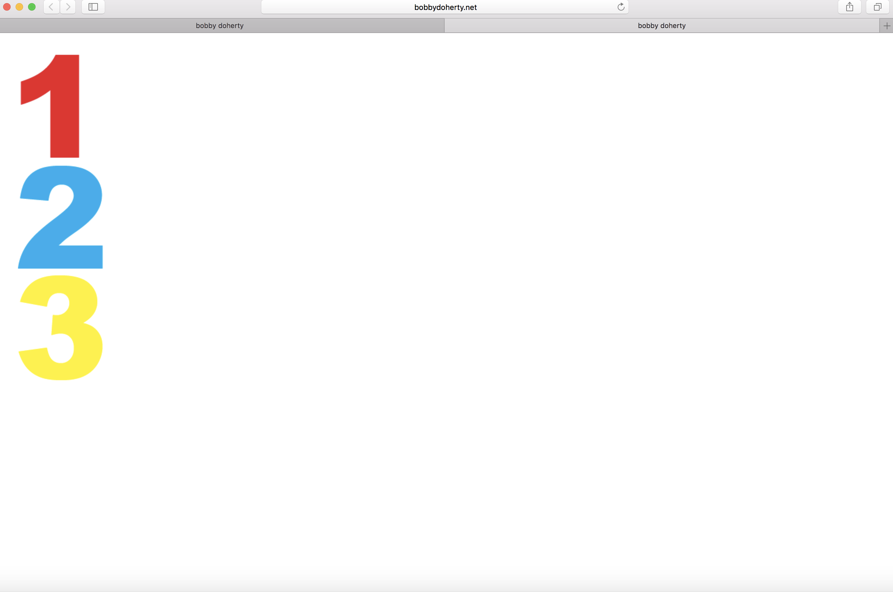
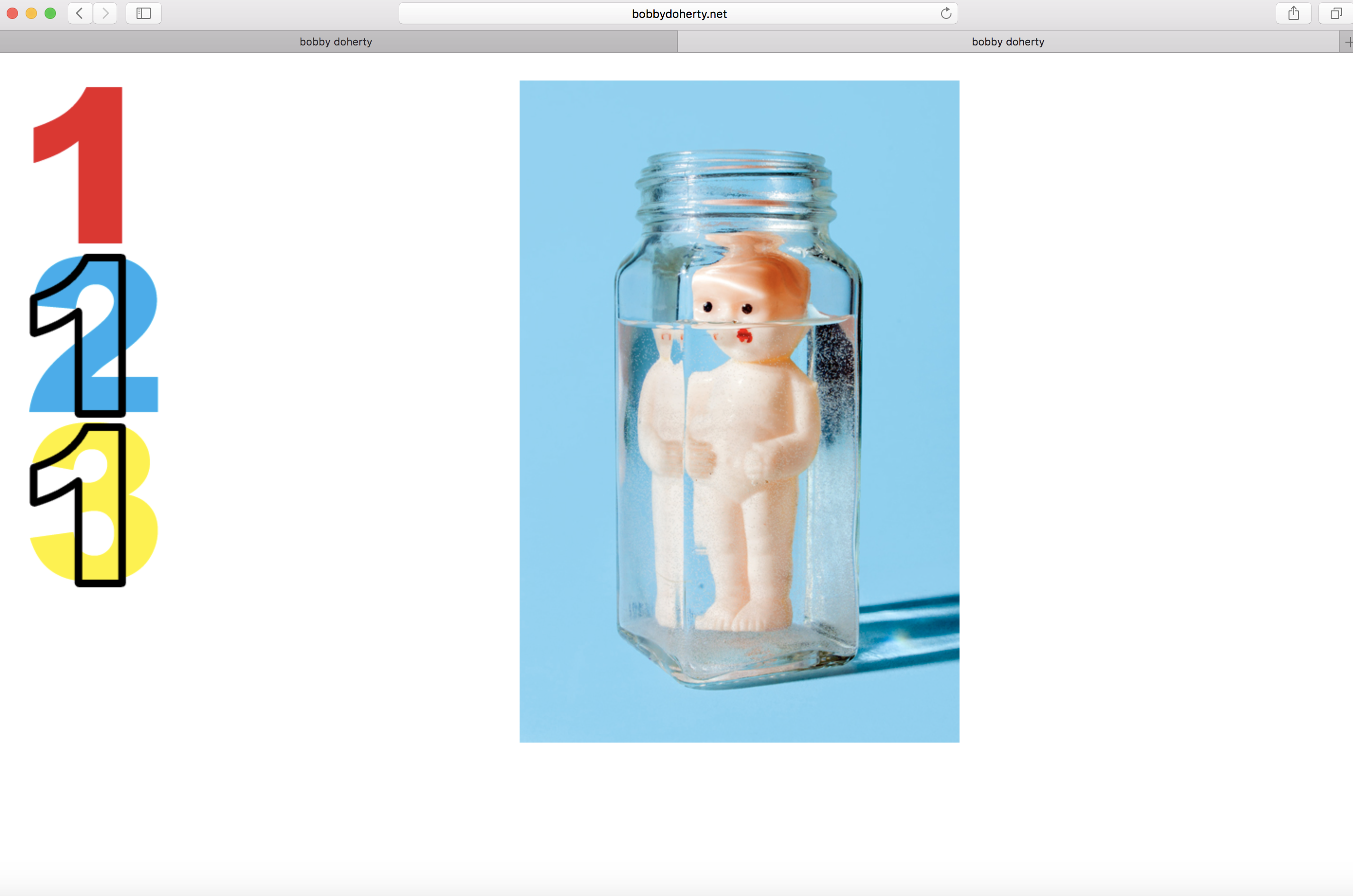
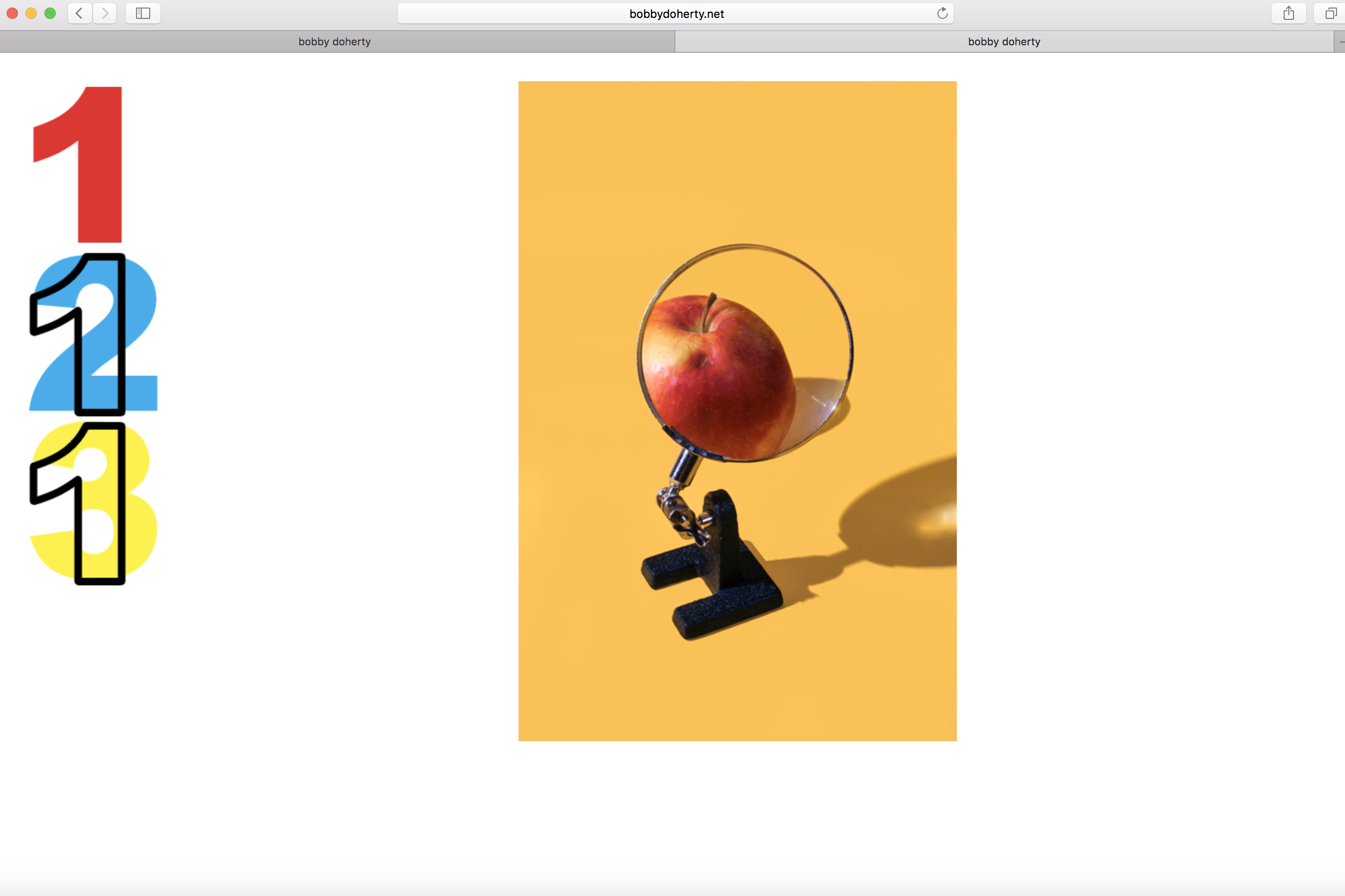
Minimal, clean, primary, exploratory
A lot of Bobby's work deals with primary colors so naturally his website has this theme. I liked that his main page only has the numbers 1, 2, and 3 and nothing else, making the viewer search for his work. You have to click the number which then only reveals one photo, which if you click cycles through to other photos. I like making the viewer have to do a little more than usual.
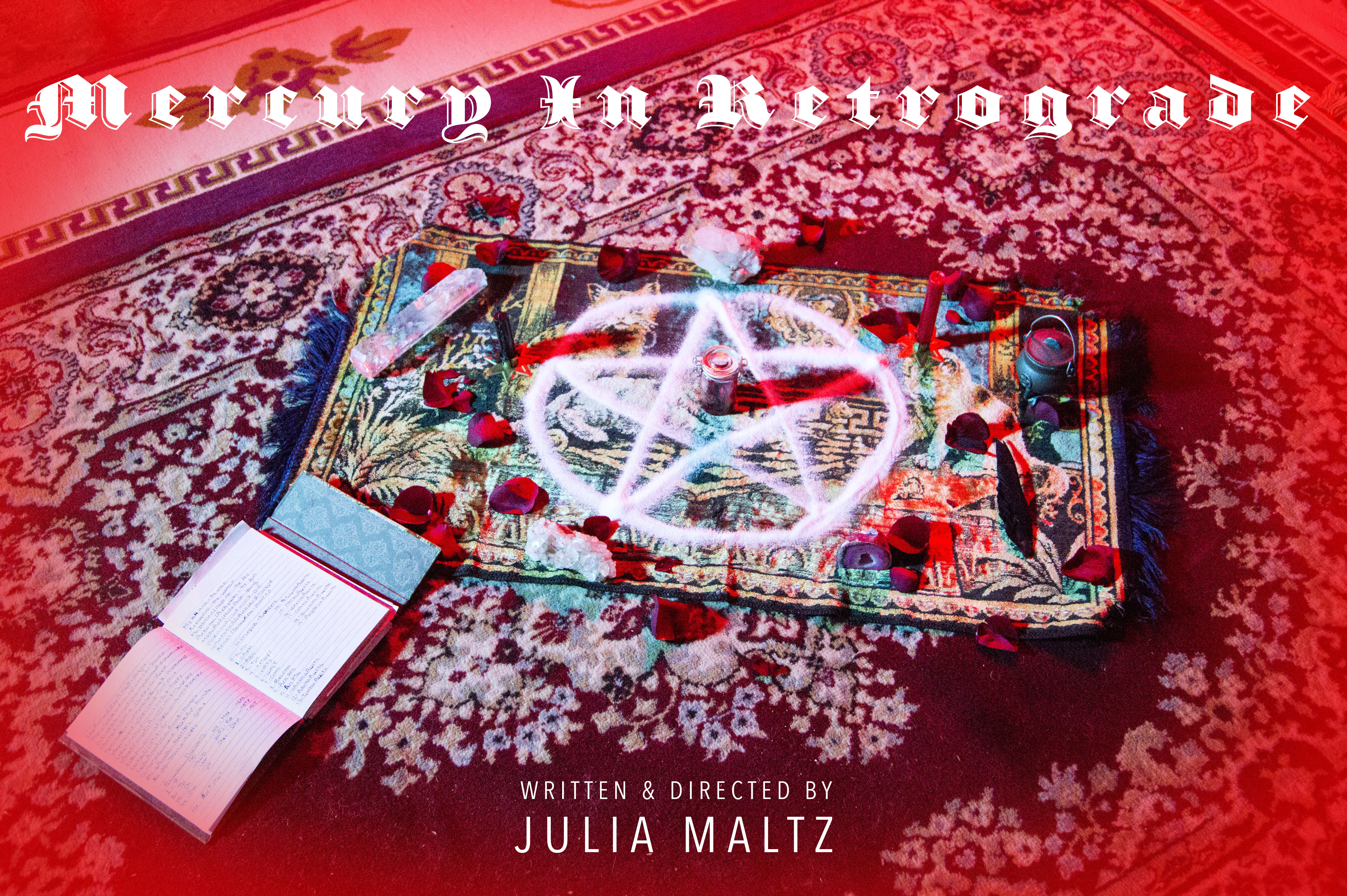
A short film supplemented by a poster and photographs

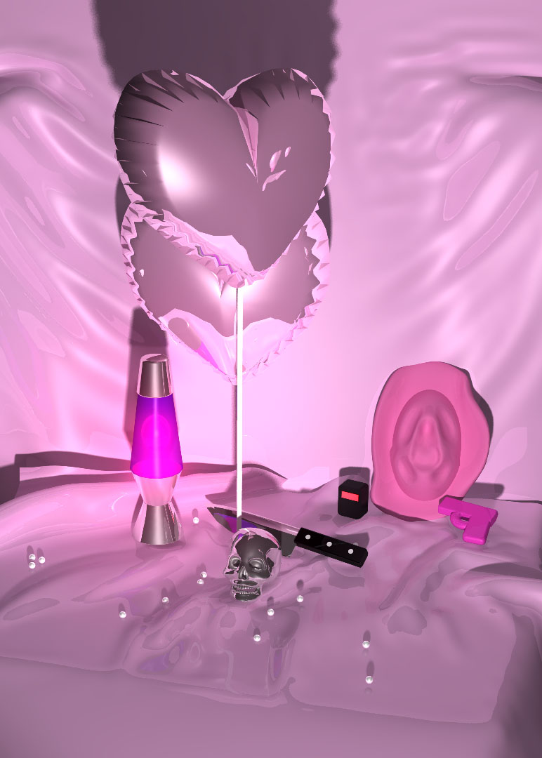
Series of photographs, GIFs, illustrations, and 3D models
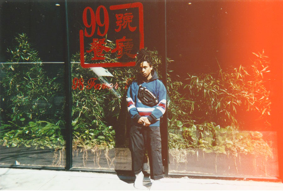
Photographic Series, Digital and 35mm film scans
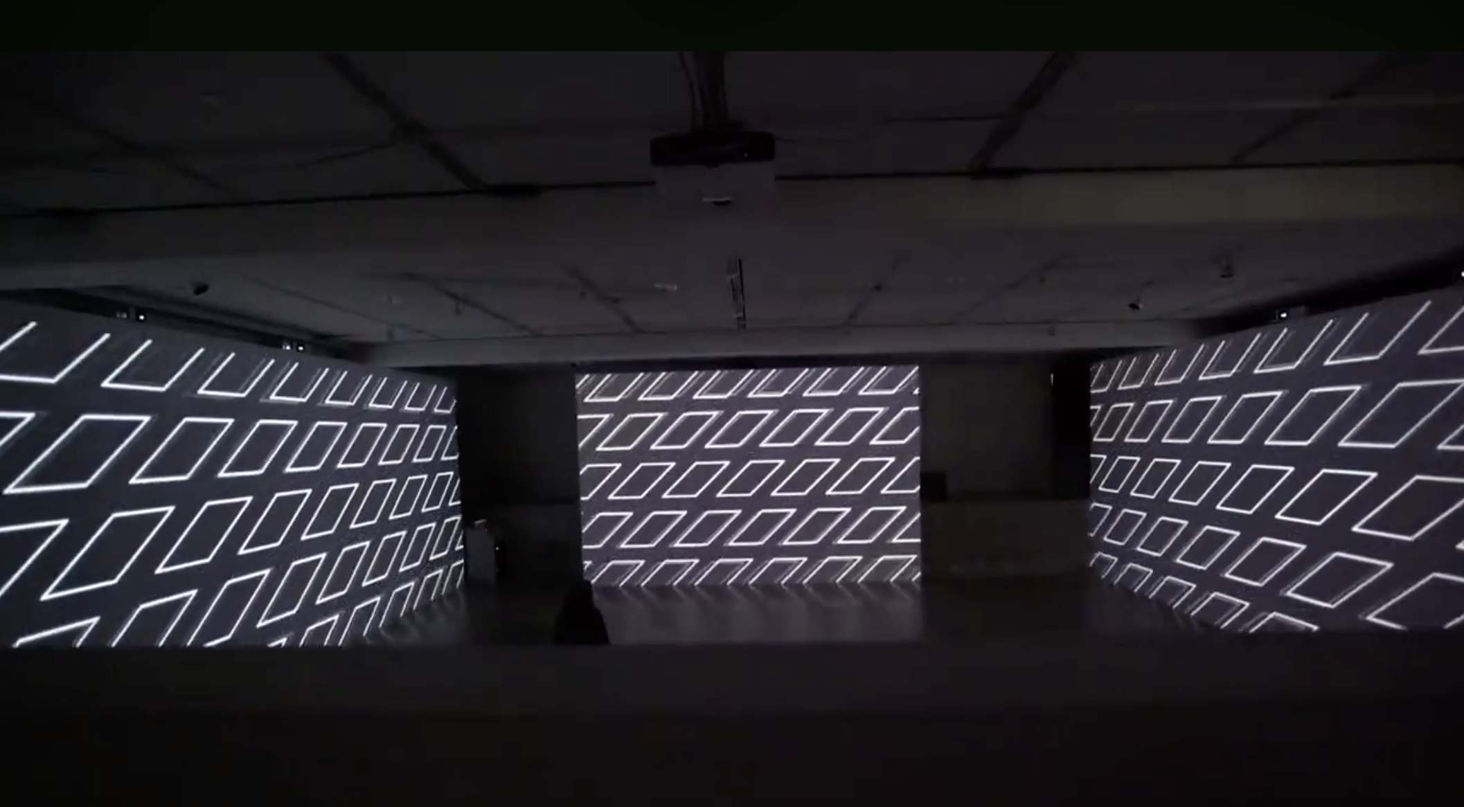
3 wall projected animation, video documentation.