DATA VISUALIZATIONS
MOTHERS SURVIVING CHILDBIRTH
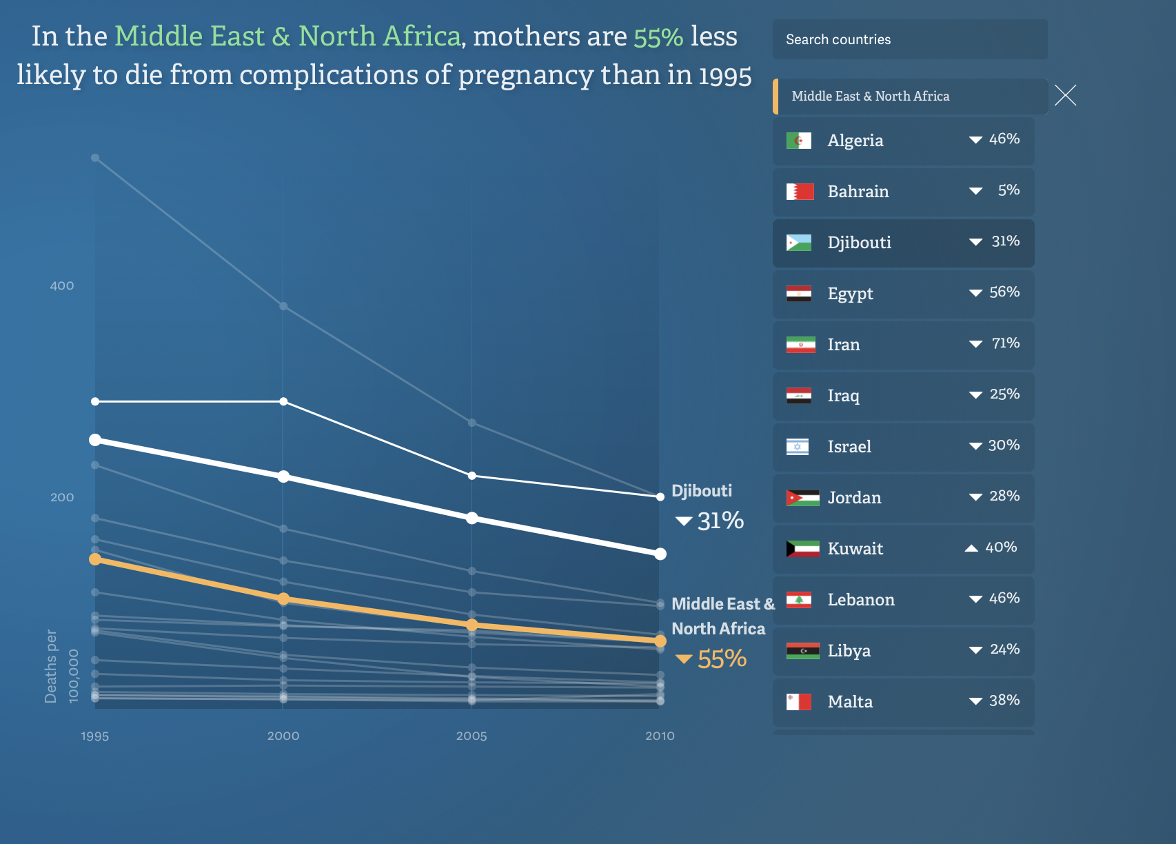
The first data that I really liked was about the improvement of maternal health around the world. When I first started to look at it , I thought that it was going to be a more interactive visualization set. However, it is one of the few static ones that I have been able to interact with. The author correlates each country with a different color and the color choicer seems arbitrary. However, every 5 year, for each country, the author gives an explanation of why the numbers are where they. When you hover over the number, everything else becomes blurred. I like this because it makes it isolated and makes the viewer notice the important behind this data set. I am more likely to believe this data because the numbers are all decreasing and you can clearly see all of the decrease amongst the countries because the visualization is static. I think this make the data seem more reliable because it shows a common goal against all countries health care for mothers during childbirth. Another thing that I like about this is that each country has a large set of data within it when you click on that country. Each country’s states have data that is included. The viewer is better able to see why the initial data is at those point and how states are c contributing to the decrease. One thing I don’t like about this is that there is only one visual representation of a number. The number is shown as a percentage next to the country’s name. This make the graph hard to read. They could limit confusion by including percentages on the y axis in additional to the number of deaths
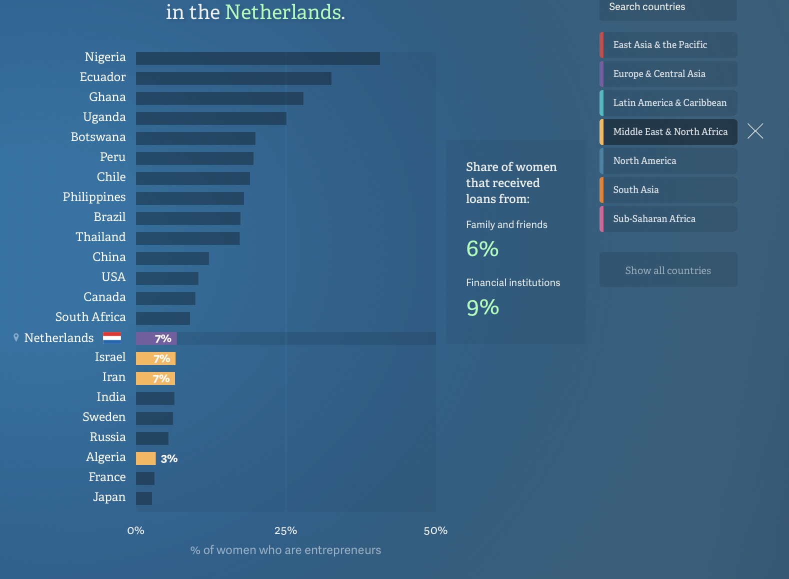
WOMEN ENTREPRENEURS
3. I really like the women are entrepreneurs. I think that this data visualization is extremely clean, sophisticated, and gets the data accurately and reliably across to the viewer. Additionally, it tells a narrative of the data set. The data is put in to bars that are rising to mimic the idea of the number of women entrepreneurs rising as well. When you hoover over a bar, the percentage of women entrepreneurs is shown. I really like how when you press on a continent, the countries in that continent are highlighted, so that the viewer can compare the to each other. One reason that I am hesitant about this data set is because I think that the word “entrepreneur” is a very loose term and there is not one universal thing that defines it. This data sets solely says that “women entrepreneurs” are business owners and I don’t think that this is true.