How are color, typography, motion, and interactivity used to convey meaning? What is the author or creator’s point of view? Why might they have chosen to create a data visualization over another form? Where does the data come from, and what makes you believe the source is or isn’t reliable?
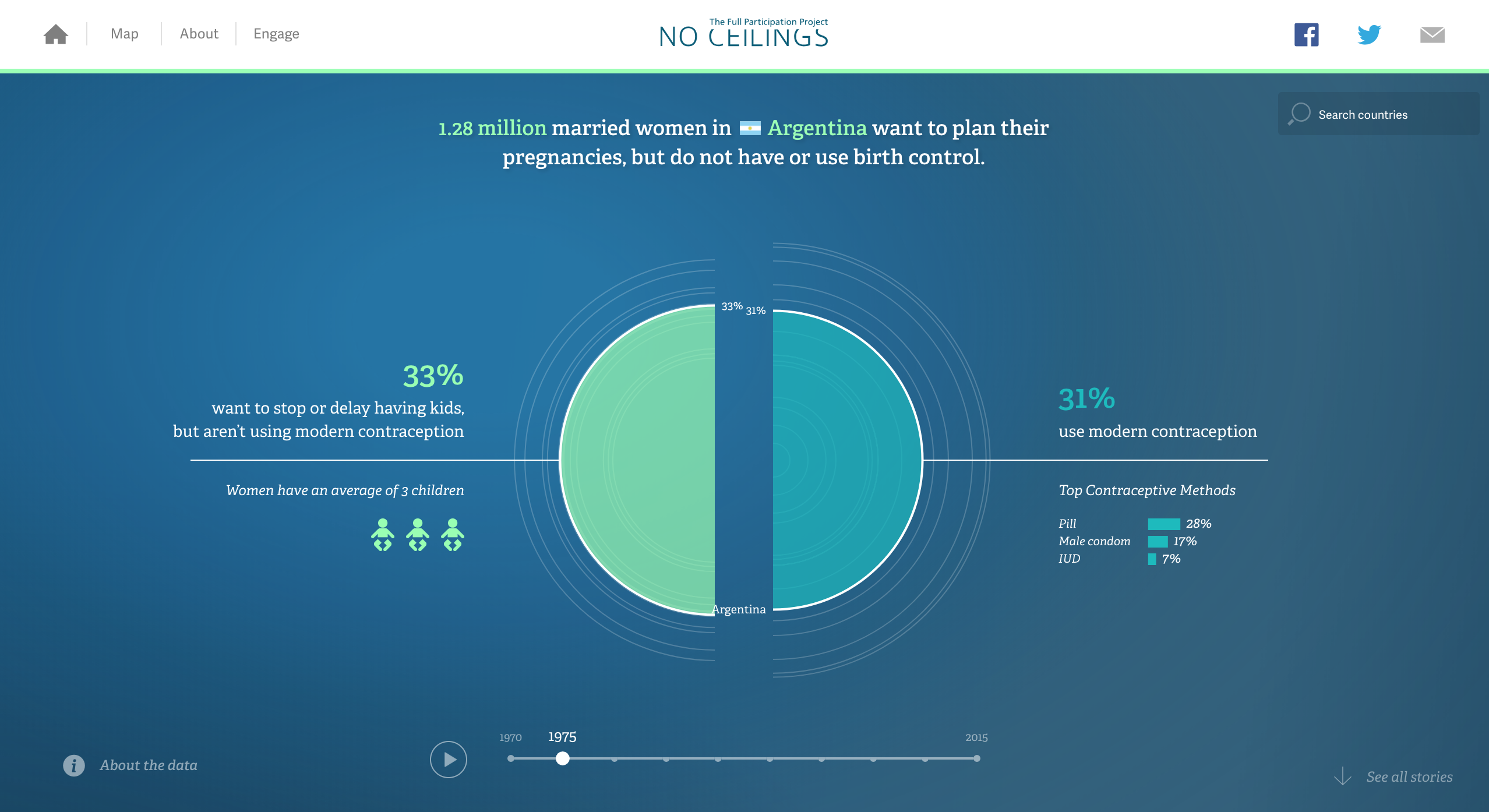
The colors within the data sequence are very soothing and easy to look at. I think this assists in the curiousity of the user because it does not distract the data but rather supports it. The interactiity within the project is so smooth that it feeds into the users curiousity. One con with the interactivity is the white outlines. It took me some time to realize that the white lines were other countries. I think they have decided to choose this kind of data visualization in reference to the female body. When I look at the data, it reminds me of a sonograph (due to the echoed lines repeated outside the circle). The data comes from the Bill and Melinda Gates Foundation and the Bill Hillary and Chelsea Clinton Foundation. I believe in the source because from the website url. It says ".org".
How are color, typography, motion, and interactivity used to convey meaning? What is the author or creator’s point of view? Why might they have chosen to create a data visualization over another form? Where does the data come from, and what makes you believe the source is or isn’t reliable?
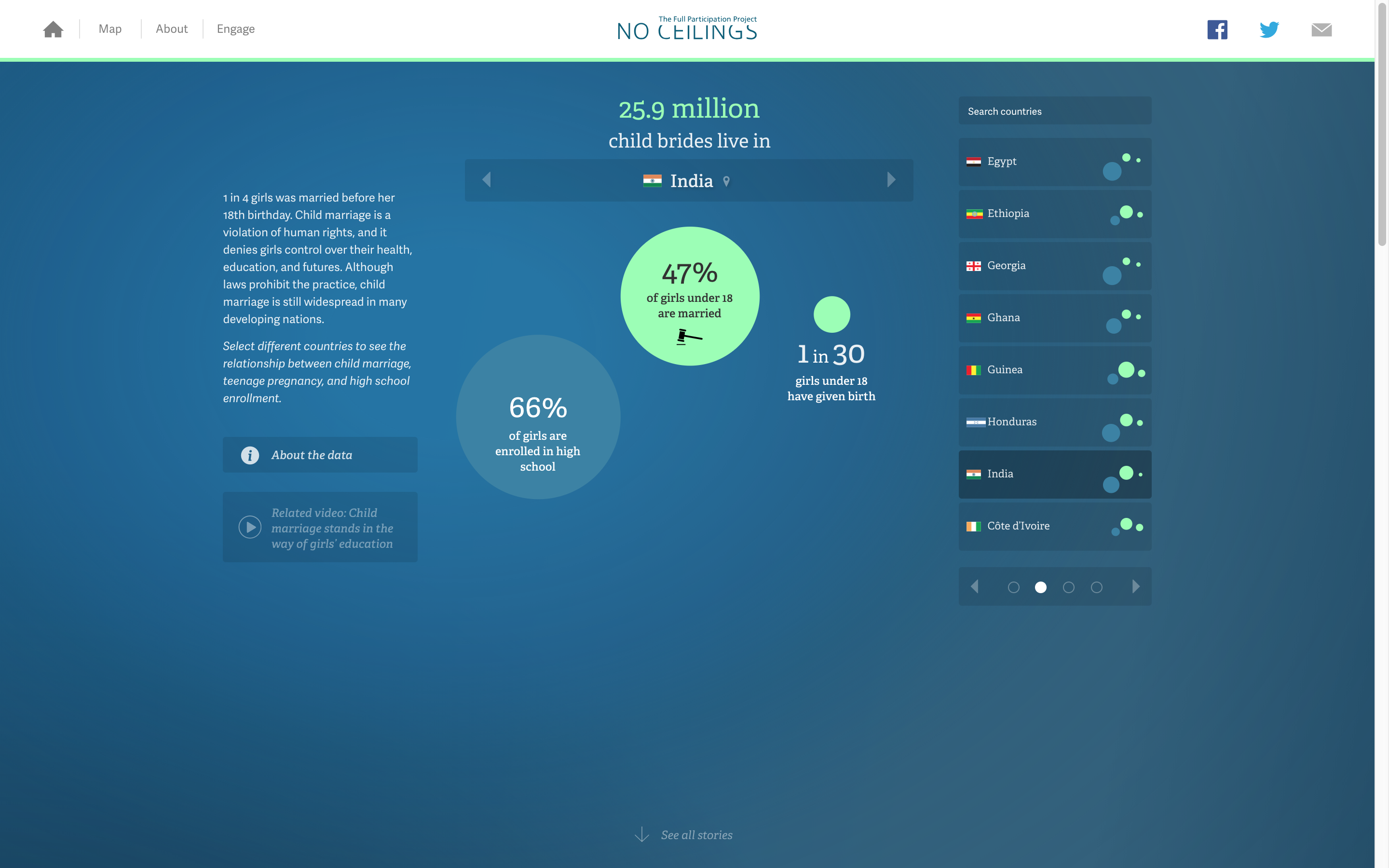
The colors are the same idea as mentioned above. The typography of the data gives a sense of power and subtleness. The interactivity is much better compared to the data visualization above. With the addition of more texts within the graphics, I was not as confused as I was when I was within the first data vis. Furthermore, the contrast of increasing circles and decreasing circle within each country is clever because you physically see the changes within each data circle.