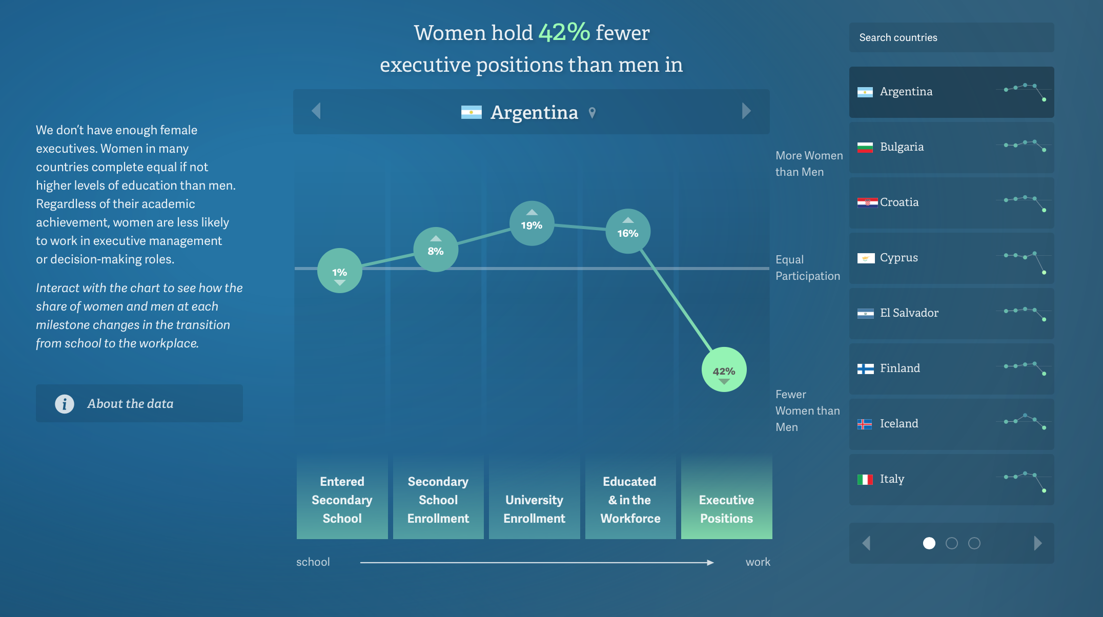
For the first visualization, I chose this graph on female executives which really caught my eye. When you click through the countries, there is an immediate response from the interface visualized through the moving of the bubbles in relation to each other. The interface feels very rewarding when clicked and interacted with. The text and color choice is very typical when it comes to data visualization. Clean and readable.
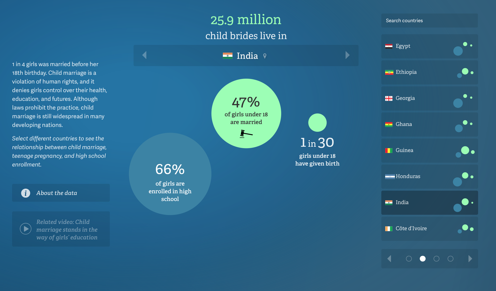
For my second visualization, I chose this graph on child brides. Like the first visualiztion, I like the changes in the size of the bubbles when clicked and interacted with. The most clever part of this page is the small dot icons across from the name of the countires to indicate what is coming next.
~~ Click this to go back to HOME ~~