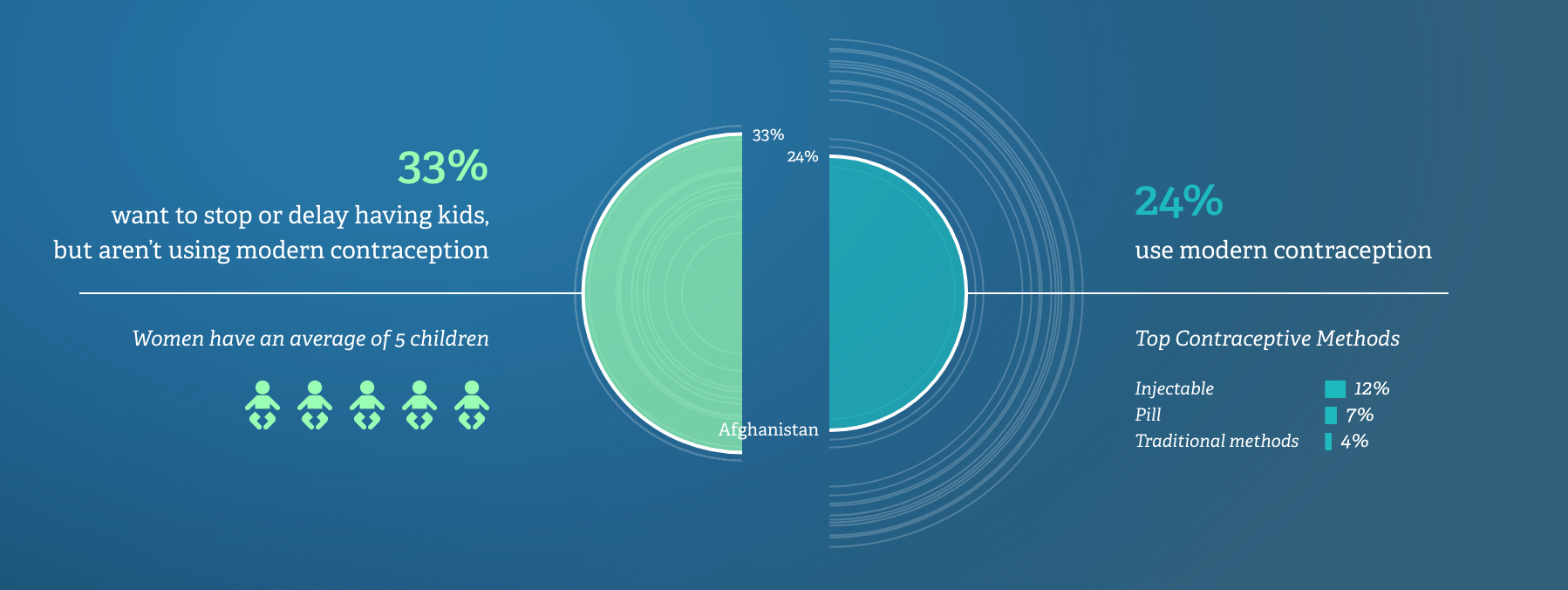
I love that for the whole website there is a consistant color scheme that is clear and concise because if it was too flowerly or colorful I wouldnt take that data seriously. It was smart for the author and creator to have a video and interactive pie chart that moves according to the year of the data. This kind of visual really helps me understand how trends have changed and modified. I think they chose this half circle chart because it's symmetrical and balances out the image and lets you look at connected data side by side.
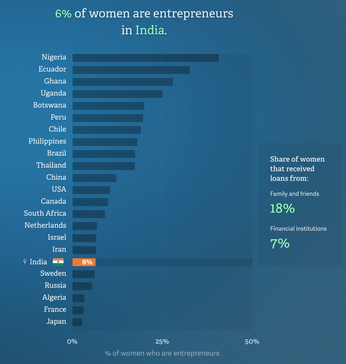
This line graph would usually be really boring but I really enjoyed how you can hover over to see the bar grow and see which country has the most female entrepreneurs. It looks like the countries are competing with each other which makes the piece seem much more interactive and fun. I think the author created this to still make a point but make it seem less boring than it is so the info is more memorable and important.