 |
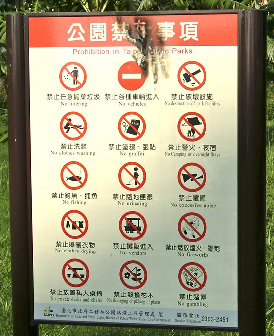
Do Not is a critique on the prevelance of public signage telling people what not to do. Most of the iconography is established for public safety or some protection of the commons, but what about a new genre of warning signs for contemporary life. I began considering the possibility of opinionated warning signs, that when juxtaposed with their appropriate location, reveal some absurdity, humor, or rebellious nature. examples of this: - do not use money (placed next to an ATM) - do not eat hamburgers (next to a burger king) - do not buy petroleum (next to a gas station) - do not shop (next to a mall) Then I started thinking of signs not from the perspective of a governmental institution but from a corporate or private individuals perspective meant to meet contemporary needs. examples of this: - do not drive - do not use wifi - do not breast feed in public - do not photograph - do not use ipod - do not touch doorknob - do not look at pornography - do not use microwave - do not drink tap water - do not download music - do not use makeup - do not pray - do not watch tv - do not use cell phone - do not write code >> |