Ocispep
Research
Ocispep began with my obsession with nutrition maxing and a growing frustration with how deceptive food packaging and labeling are in the U.S. I spent a month researching the FDA’s labeling standards and how they compare globally, focusing especially on the stricter, more transparent system used in Mexico. What I found was both overwhelming and deeply disheartening—the FDA’s outdated regulations allow for confusing, often misleading packaging, while companies use marketing design to obscure nutritional flaws. My research included studying recent lawsuits against Pepsico products like Aquafina, Tropicana, and Naked, which directly informed the three fictional beverages I developed: Dekan, Anaciport, and Anifaqua. These drinks parody the real ones and serve as vessels for critiquing how corporate brands hide behind bright visuals and vague health claims.
Prototype
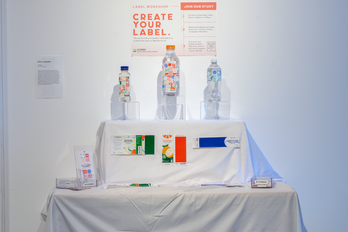
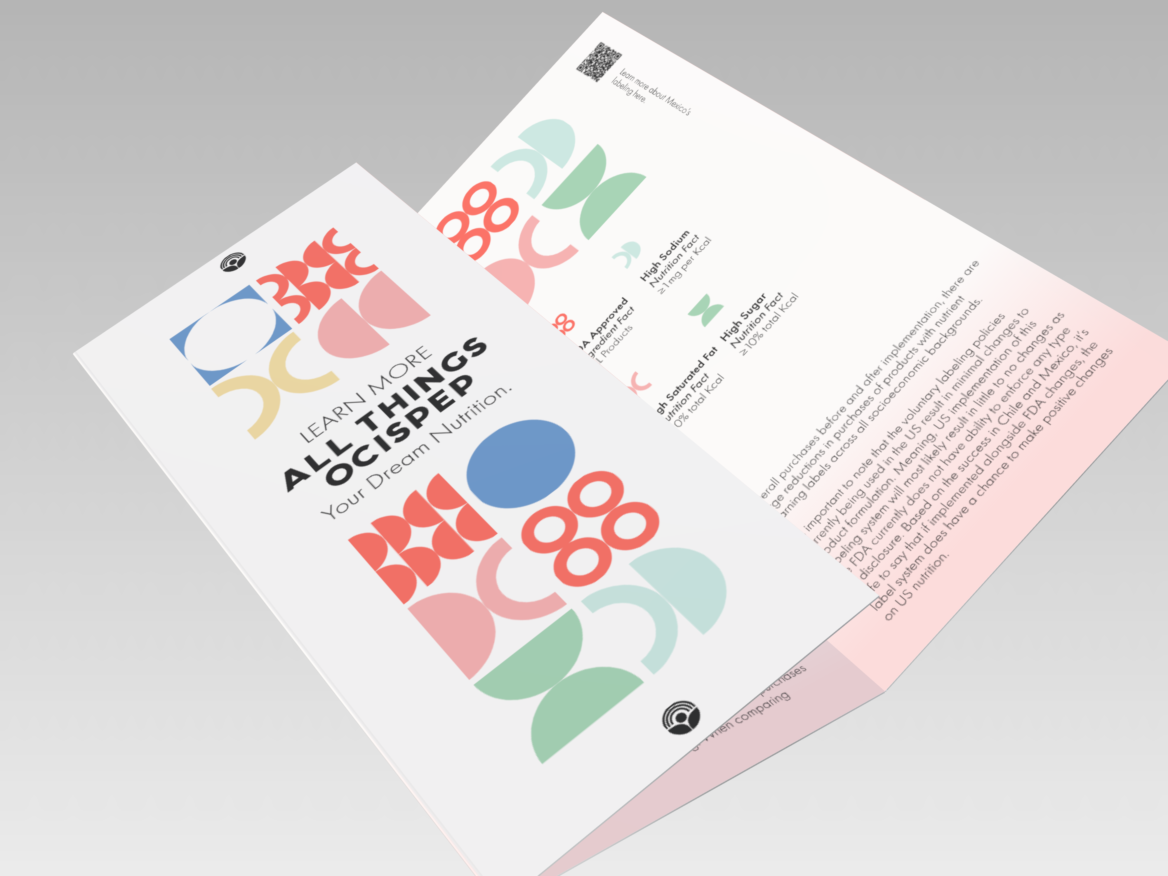
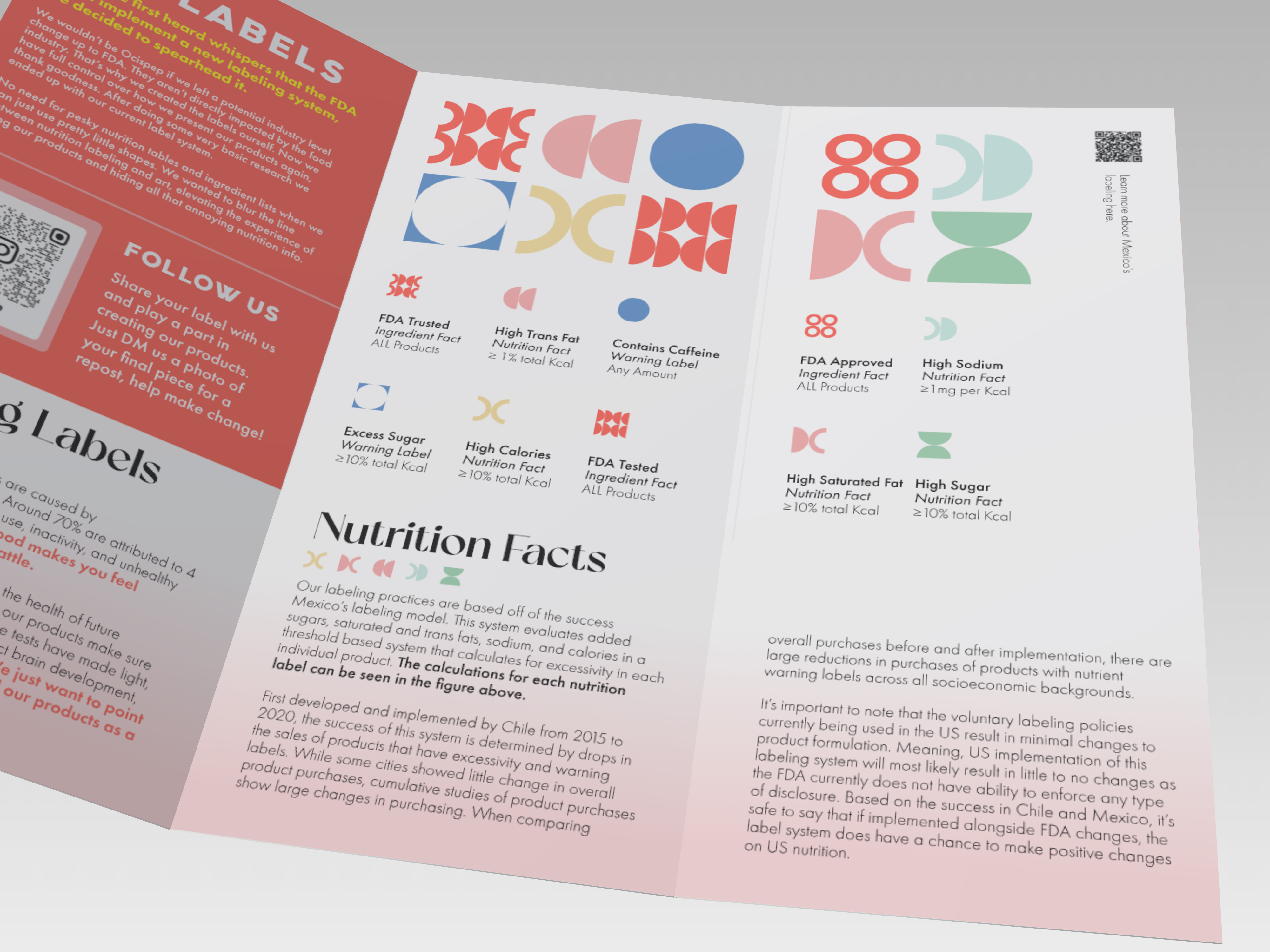
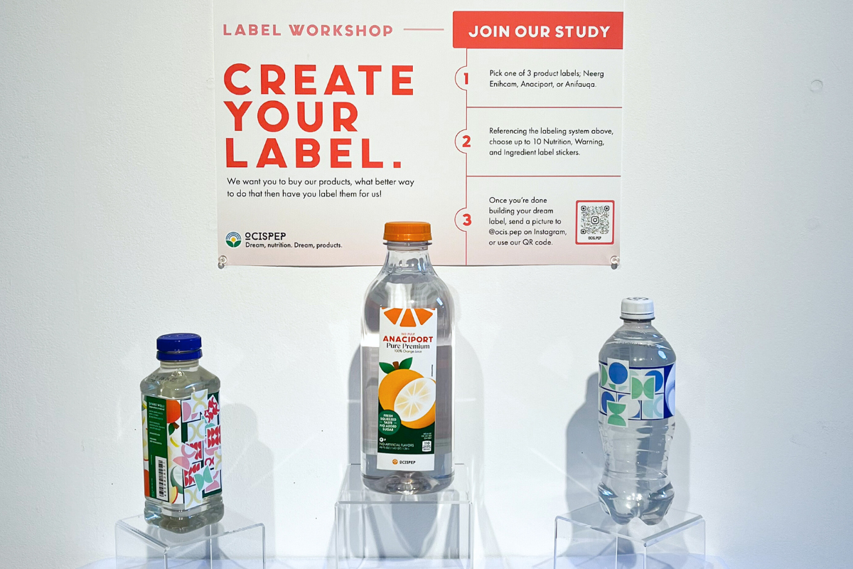
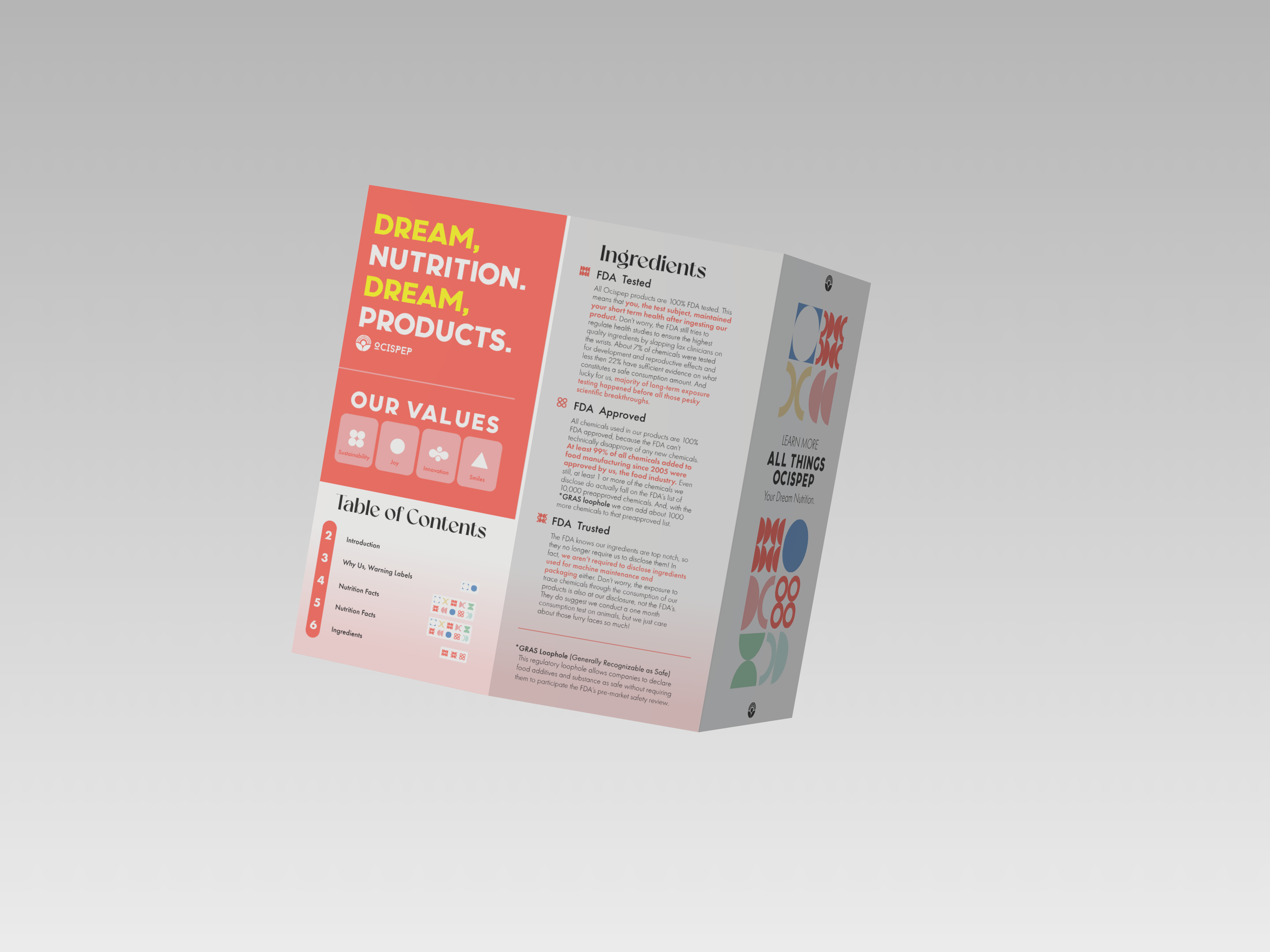
Guided by the design language of Pepsico and U.S. food conglomerates, I developed a fictional sub-brand—Ocispep—and designed three beverage lines that embody a marketing-first, health-second mentality. I built a packaging system based on Mexico’s nutrition warning symbols but adapted it into something intentionally exaggerated and ineffective. I created eight total symbols, including warnings like high sodium, high sugar, and contains caffeine, as well as three categories I invented: FDA Approved, FDA Trusted, and FDA Tested. These invented symbols were given rounded, brightly colored icons that had no visual connection to their meaning—used not to inform, but to evoke comfort, friendliness, and corporate trust. The visual tone is purposefully silly, clean, and overdesigned—mimicking the useless optimism that coats real packaging today.
Solution
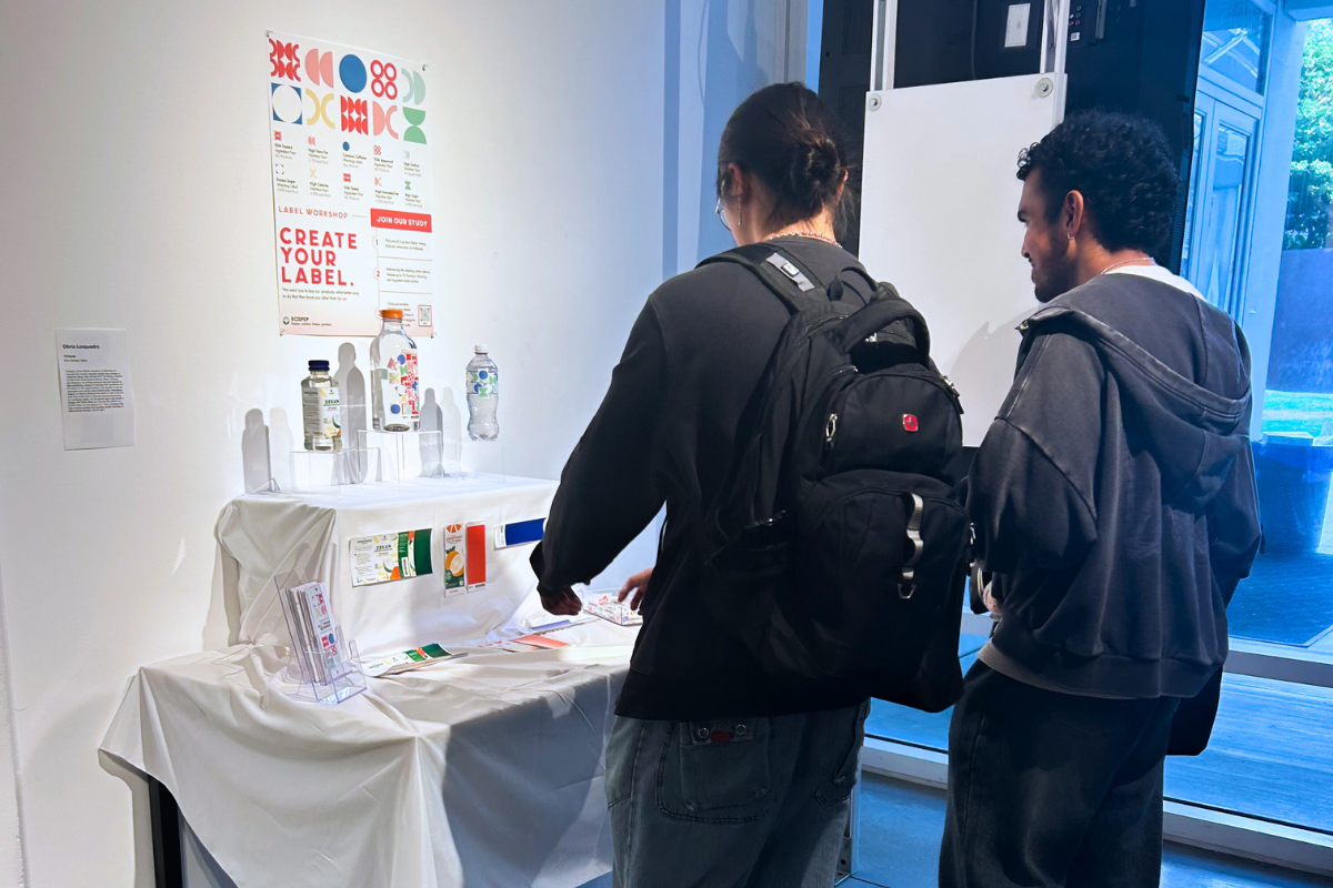
The final deliverables included three fully designed product packages, each with its own set of ironic labeling and satirical brand voice. Dekan (inspired by Naked), Anaciport (a parody of Tropicana), and Anifaqua (mirroring Aquafina) were displayed as a mock workshop table at Epilogue Coda, the 2025 senior capstone exhibition at UCLA’s Experimental Digital Arts Gallery. Each label featured a full suite of modified nutrition facts and warning icons, along with playful, almost corporate-poster-level branding designed to look “healthy” at a glance while saying nothing useful upon inspection. The workshop-style installation encouraged gallery visitors to interact, inspect, and question the very systems they usually ignore in a grocery store setting.
Results
Ocispep served as both a visual and conceptual critique of the FDA’s loose nutrition standards and the way design is used to manipulate consumer trust. The project generated meaningful conversations at the gallery, especially among viewers familiar with food marketing or policy. Visitors often laughed first, then looked closer—and realized just how close this parody is to reality. While the project doesn’t solve the systemic issues around food labeling, it exposes and exaggerates them through design, opening up space for reflection and criticism. Ultimately, Ocispep transformed my personal frustrations with nutrition and design into a visual language that’s ironic, corporate, and uncomfortably familiar.