Bioblot App
Research
In the research phase, I analyzed 23andMe’s user experience to identify strengths and gaps relevant to our own platform. While 23andMe offers strong genetic data visualizations, its interface often leans heavily on scientific jargon and assumes a certain level of baseline knowledge. This inspired me to take a more inviting and educational approach in BioBlot’s design—transforming dense medical content into small, approachable insights that meet users where they are. This analysis confirmed the importance of visual hierarchy, plain language, and emotional accessibility in health-focused design.
Prototype
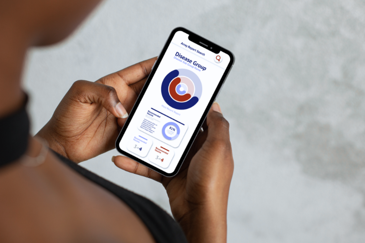
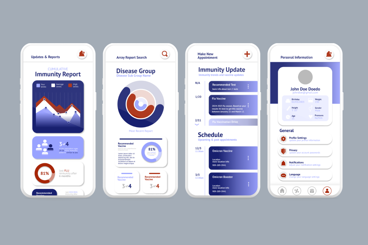
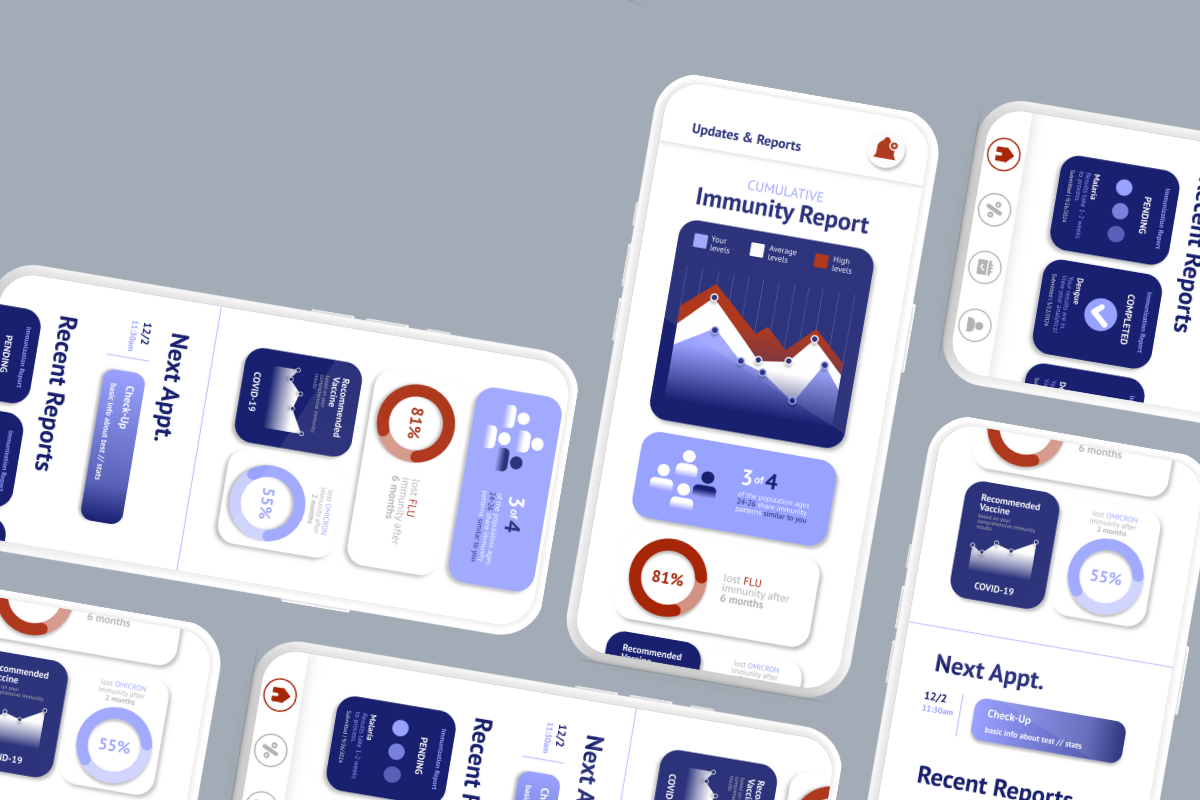
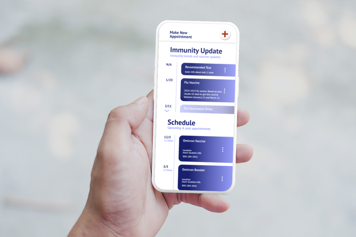
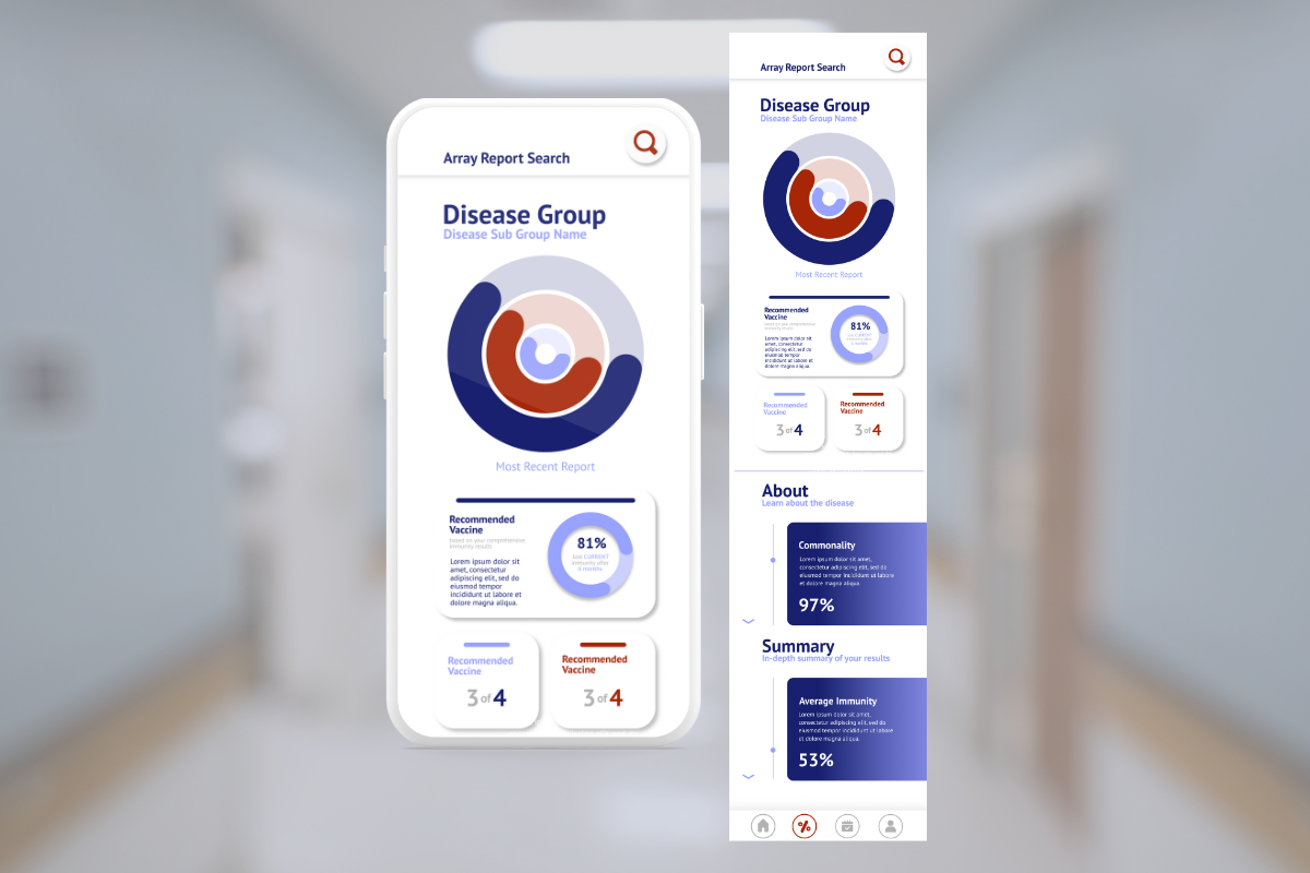
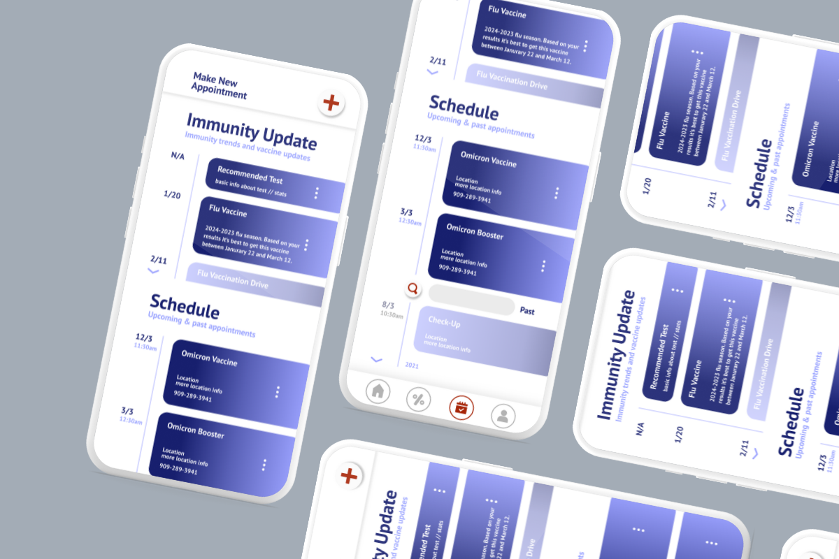
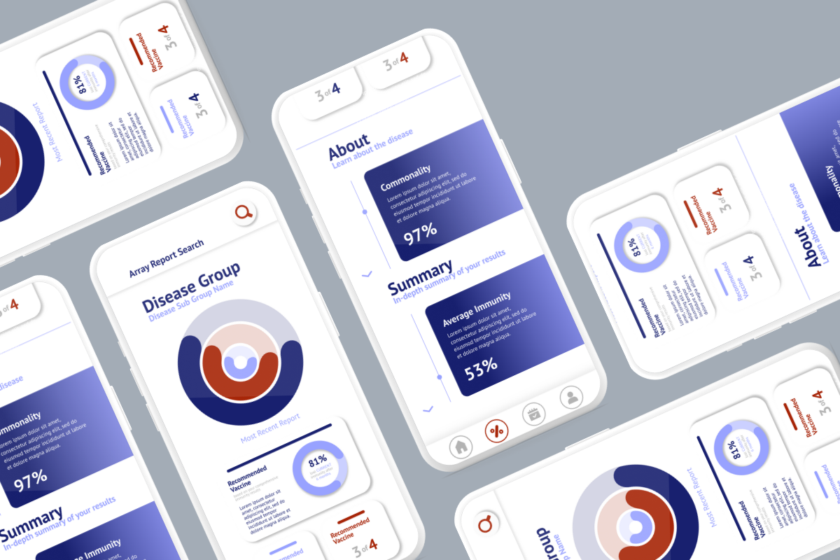
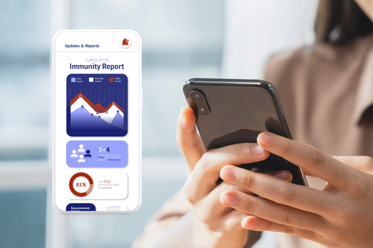
I created five key pages for the app: the home dashboard, user profile, results upload page, educational insights hub, and the immunity results page. The immunity results page, in particular, was crafted to break down sterile lab data into bite-size, easy-to-read summaries—pairing charts with friendly explanations and small lifestyle recommendations. The visual language of the app uses a soft, welcoming color palette with calming blues, greens, and neutral tones, along with rounded shapes and gentle spacing to avoid a clinical feel. Typography is clean and legible, while layouts are intentionally uncluttered to promote clarity and user confidence.
Solution
Each high-fidelity screen was designed to deliver information with warmth and clarity. Interactive elements guide users naturally through their health journey—without overwhelming them with too much information at once. The immunity results page includes modular widgets and visual indicators to highlight trends, progress, and tips for improvement, all designed to support a positive and intuitive experience. While I did not work directly with developers, the design files were structured for seamless future handoff, with consistent components and detailed documentation for implementation.
Next Steps
The next stage involves conducting usability testing to gather feedback on navigation, comprehension, and visual clarity across all five screens. Following this, refinements will be made to ensure the app continues to align with user needs and expectations. Once live, key metrics such as page engagement, time spent on results, and repeated logins will be monitored. This project taught me the importance of designing with empathy—creating a health app that informs, supports, and invites users to take control of their well-being without fear or confusion.