YOU-Ti
Research
The research phase centered on healthcare branding and pharmaceutical aesthetics, ensuring that every element of the game reinforced its polemical stance. Typography, layout, and color theory were meticulously considered to mirror the visual language of medical marketing, creating an immediate sense of authenticity and unease. Blue, a staple in healthcare branding for its associations with reliability and calm, was juxtaposed with yellow—both as a nod to UCLA’s colors and a clever reference to the game’s namesake, YOU-TI.
Prototype
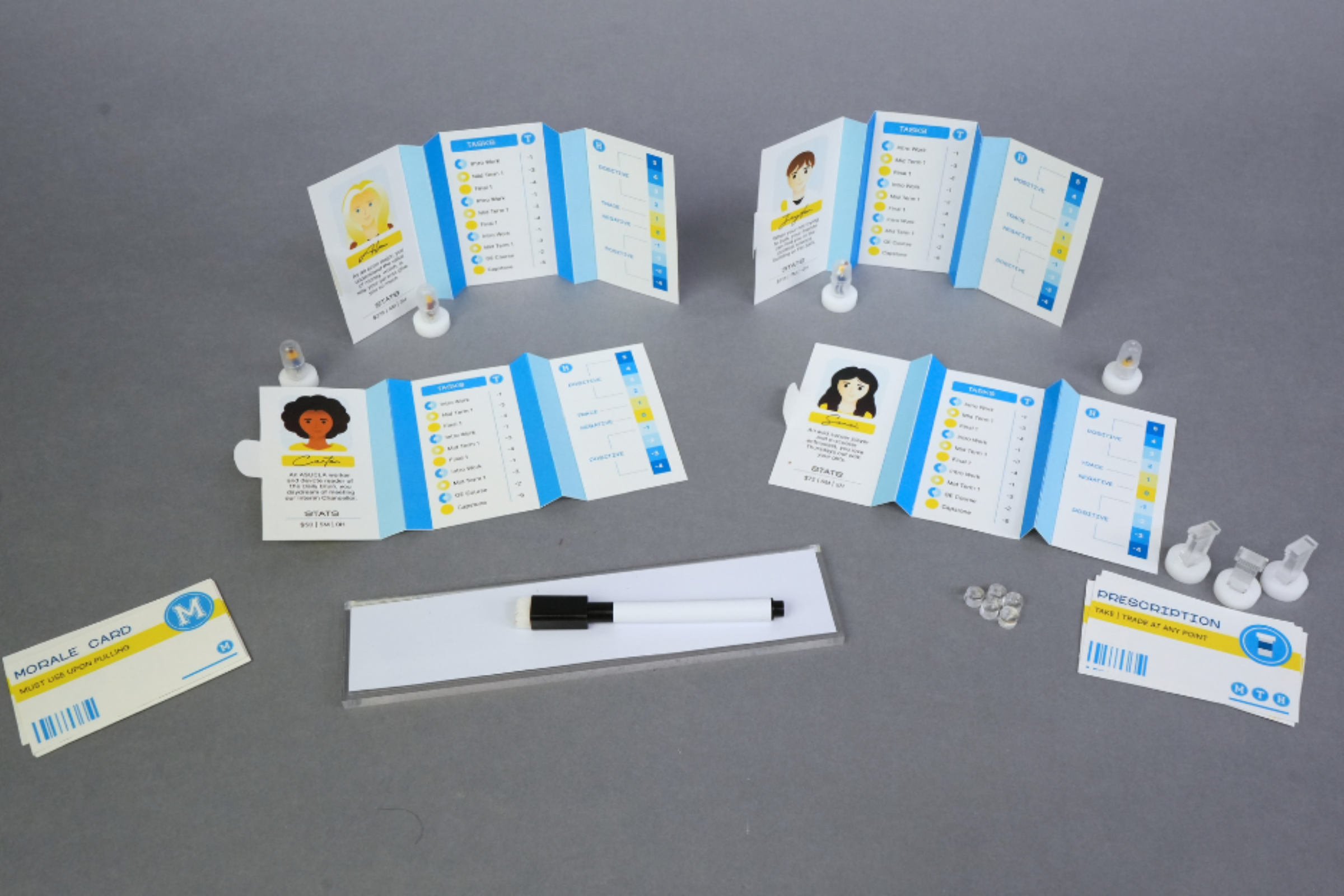
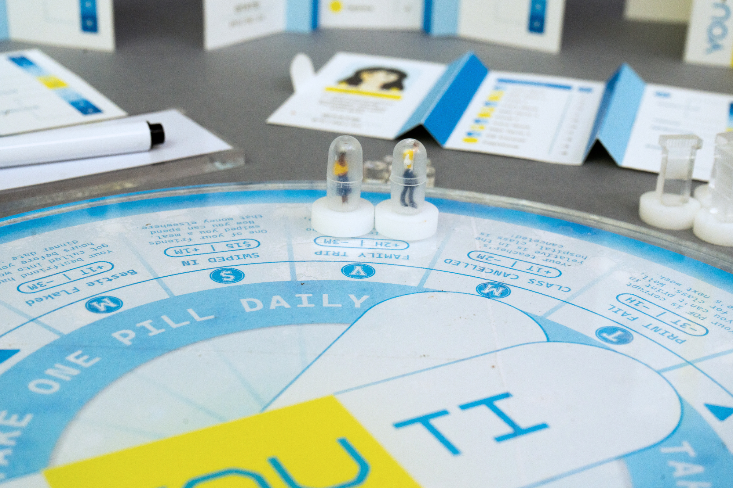
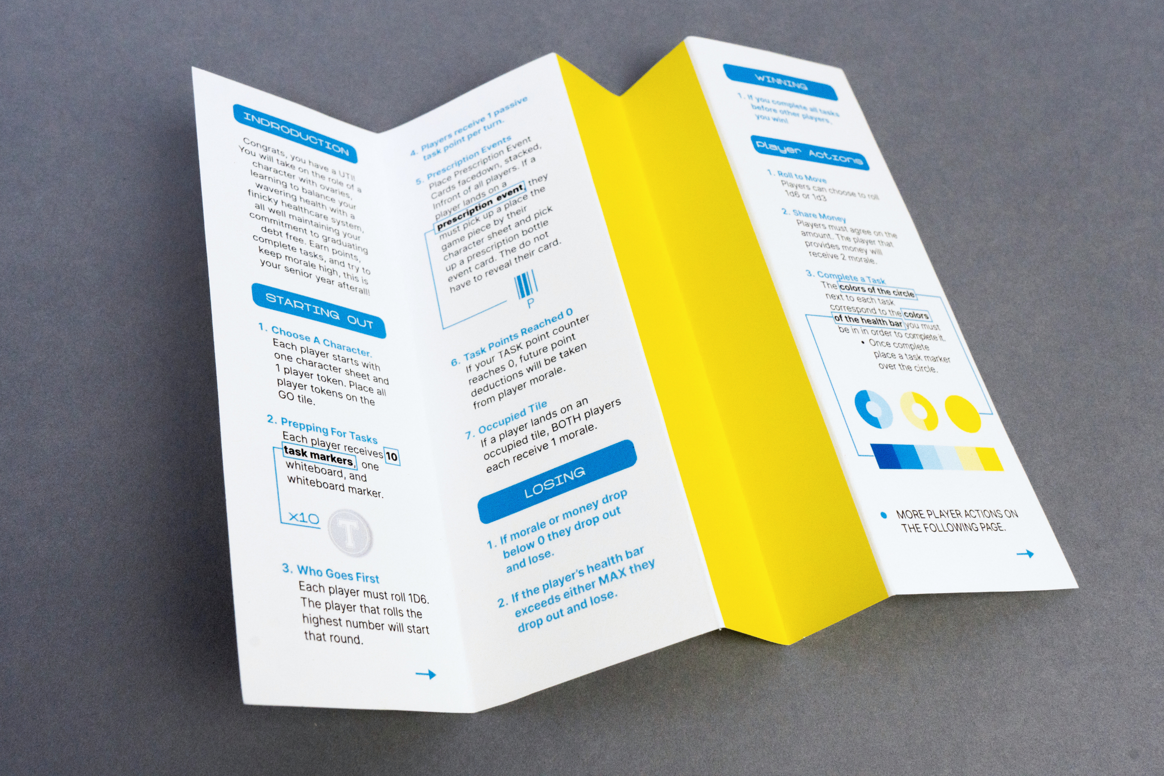
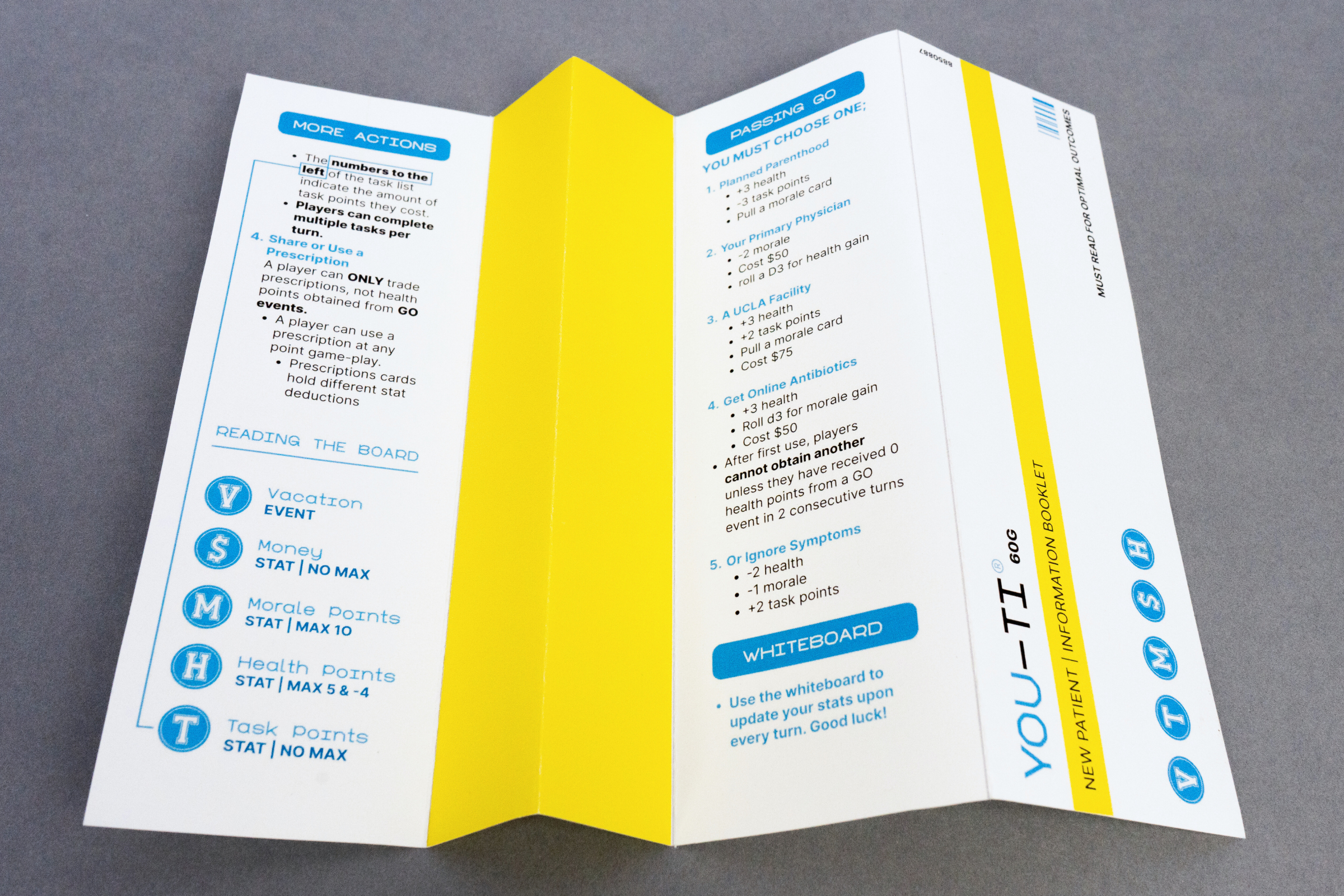
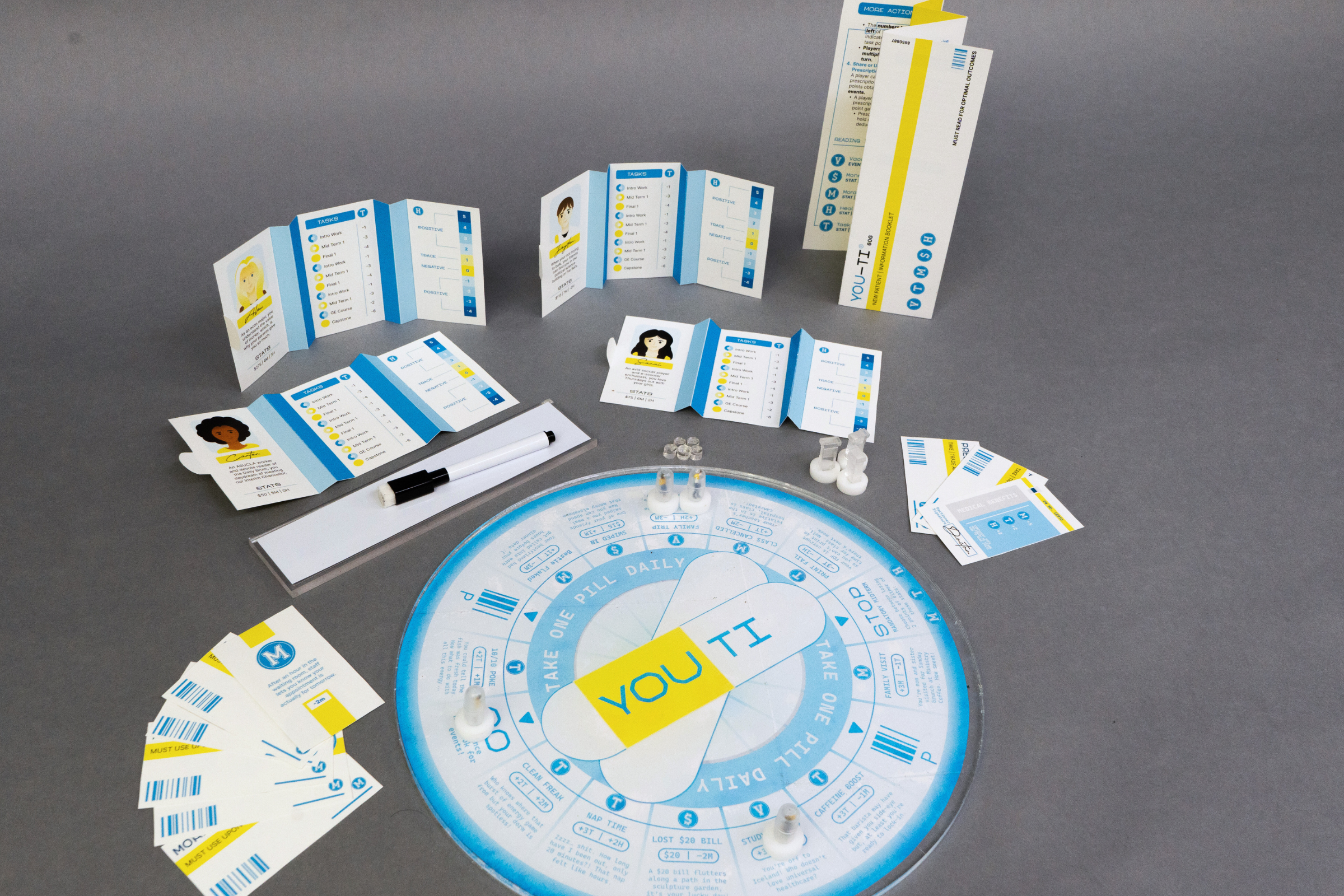
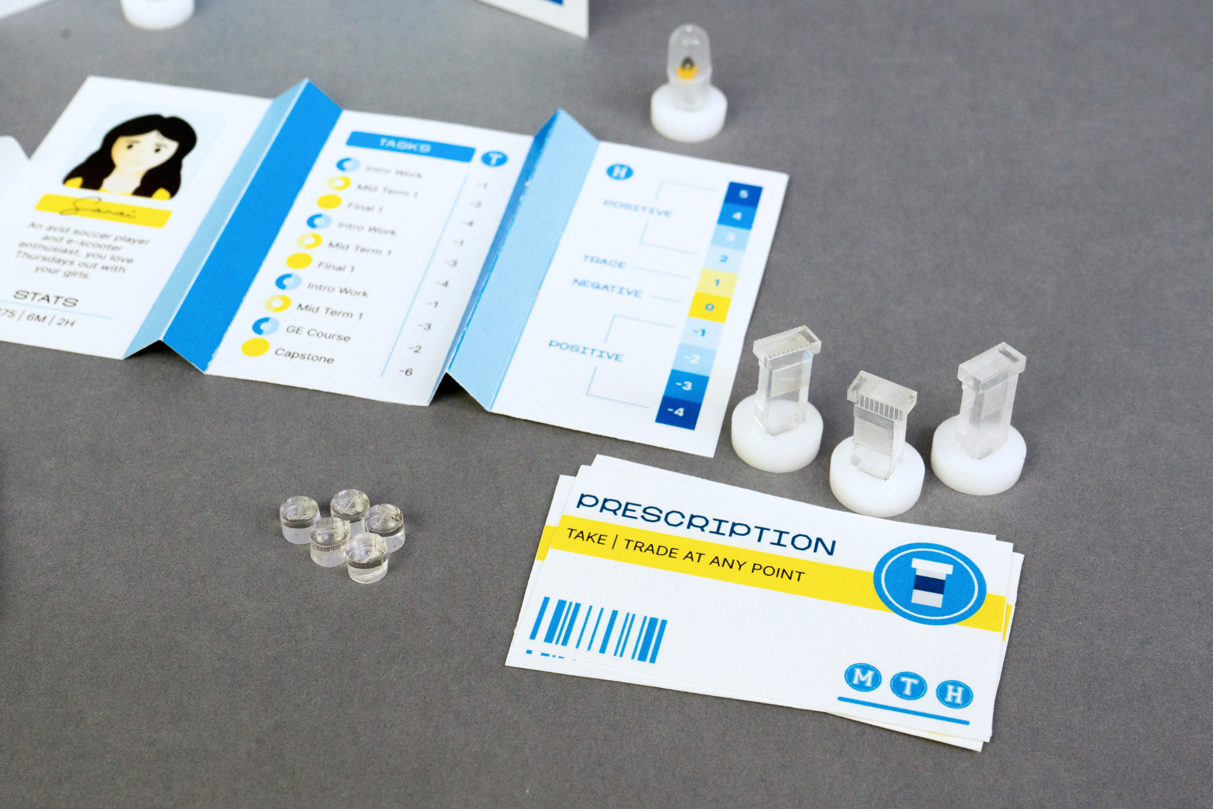
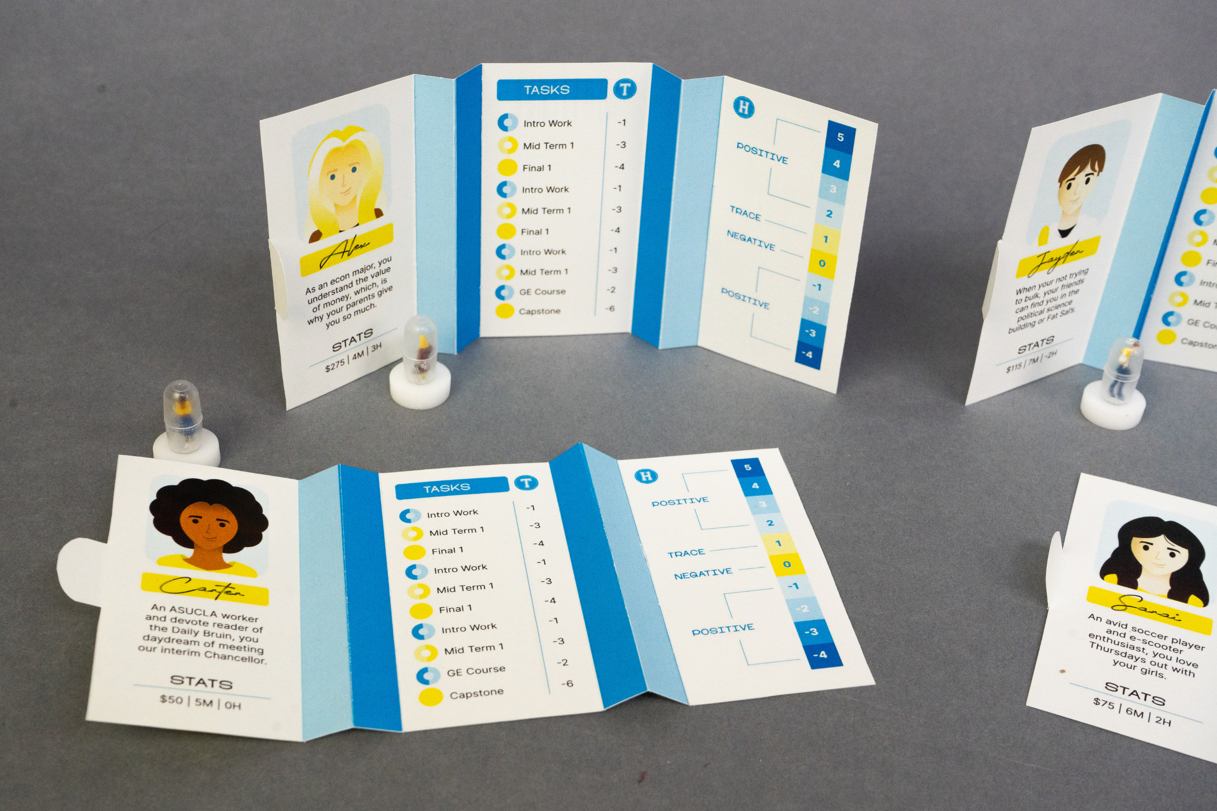
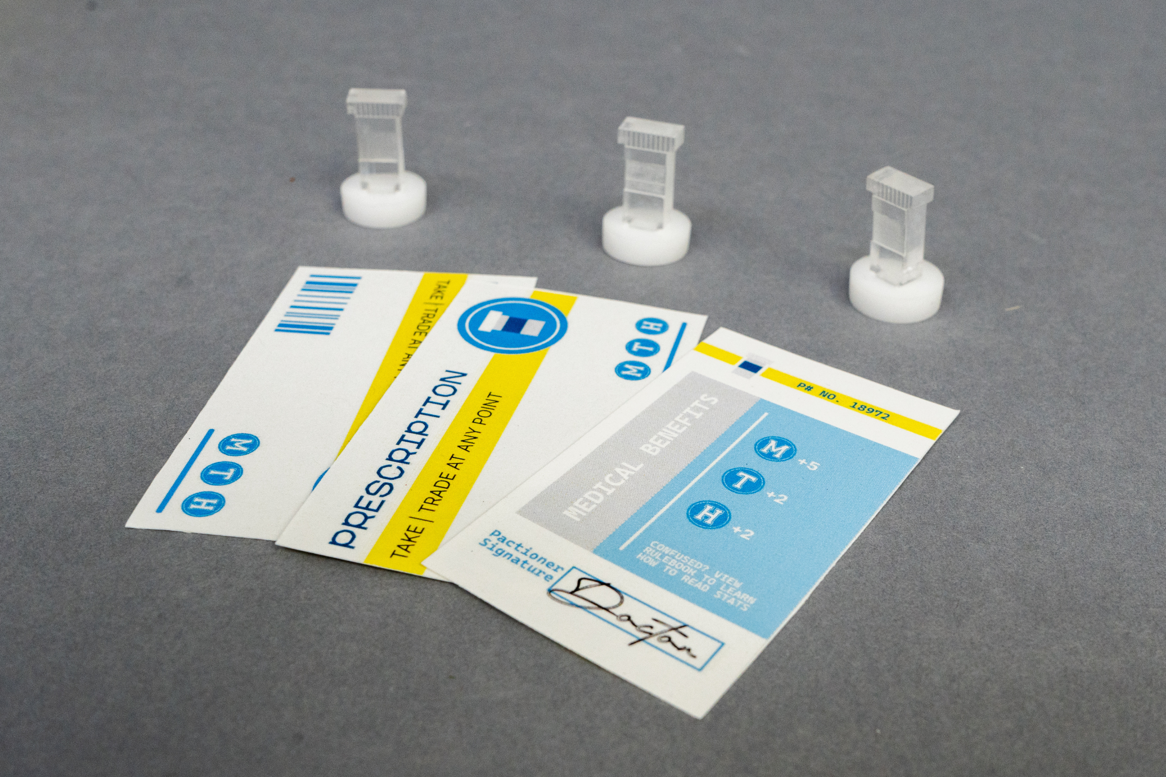
Prototyping demanded a high level of technical skill and precision. The game required a laser-cut board, fabricated prescription bottle game pieces, custom-designed and printed player cards, laser-cut tokens, and a meticulously crafted rule sheet—all of which had to not only function seamlessly but also contribute to the game’s overarching message. The rule sheet was particularly critical; folded and designed to resemble prescription warning inserts, it reinforced the bureaucratic confusion often experienced in medical treatment. Character sheets, inspired by medication packaging, folded into a box-like form, symbolizing the commodification of health. Most notably, the health bar, a core game mechanic, was designed to mimic a UTI test strip, visually tying game progression to real-world diagnostic tools.
Solution
The final solution was a fully realized, market-ready game that effectively blended social commentary with engaging mechanics. Every detail, from the vector-based character illustrations to the minimalist design approach, was fine-tuned to maintain a stark, clinical aesthetic. The contrast between the clean branding and the frustrating gameplay experience underscored the real-world challenges of managing health within a flawed system, making the game’s message all the more potent.
Results
The most significant challenge was the extremely short development window. With only two weeks to design, iterate, fabricate, and test, every decision had to be calculated, efficient, and flexible. The process demanded a rigorous schedule, balancing creative exploration with precision execution. Troubleshooting fabrication and printing errors was a key priority, as there was no margin for error in delivering a polished final product.
Ultimately, YOU-TI not only achieved its goal but surpassed expectations. It stands as a successfully executed polemical board game, using design as a tool for discourse while maintaining an engaging, well-structured gameplay experience. The game’s adoption as a template for future classes solidifies its role as both an educational resource and a thought-provoking critique of the healthcare system, proving that design, when executed with intention and rigor, can transcend aesthetics to spark meaningful conversation.