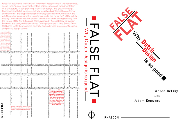
False Flat - using rules and blocks
This is a redesign for the book cover of False Flat. Every week, we are given new parameters that we have to follow. For this design, I was allowed to use the Grotesque MT font family (one only), no condensed or extended fonts, any point size combination, the usage of blocks and rules, and one color with all its values as well as black. The design of my front cover is inspired by the works of Jan Tschichold. I modeled the back cover off of Piet Mondrian's Composition With Yellow, Blue, and Red. Instead of using red, yellow, and blue though, I used different values or red to represent it.
