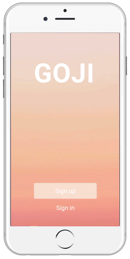
Goji
Product Design, UI/UX Design
What is Goji?
Goji is a travel app for iOS and Android that allows you to find flights based on your budget rather than your destination. Simply enter the city you wish to fly from, your price range, and time range and Goji will show you a list of flights fitting your criteria.
Team
I am currently in the process of developing Goji with Stan Kuboi.
Problem
Many people in their early to mid-20s want to see foreign countries and experience different cultures but also have to operate on a tight budget. Almost all websites and apps require you to input a final destination when looking for flights, thus requiring the user to try a multitude of locations before finding a flight that fits their budget.
Solution
Goji places priority on the user’s budget rather than a desired destination. It shows all available flights fitting the user’s budget and takes the guesswork out of finding an affordable flight.
Research
I began my research by informally surveying friends and colleagues between ages 20 and 27. All 42 survey participants said they have had trouble finding flights fitting their budgets at some point. 39 of 42 participants said they would be open to forgoing an initially desired vacation if a significantly less expensive flight was available to another interesting location. Many of these people mentioned that they would be fine traveling anywhere in the world if they could do it affordably with their friends.
I next searched for programs similar to Goji’s concept. Most websites like Orbitz or Expedia require users to input a specific destination. A British based company called Whimsy has a desktop website that performs a function similar to Goji’s, but the website only works for people flying out of London Heathrow and does not have a mobile app. Wing It Travel is an app that also is similar to Goji, but it fails to actually find flights within the selected budget and gives results sometimes over $500 over the actual budget. Kayak recently introduced a feature on their app to find flights based on the user’s budget, but it seems to be more of a special bonus rather than a main feature. The page is difficult to locate in the app and and it causes the app to freeze most times.
Goji Name
I decided on the name “Goji” because of its playfulness and because it contains the word “go” in it. The goji berry itself is known for its novelty, health benefits, and its reputation as a superfruit, thus establishing a positive connotation. I also wanted to keep the name short so it reinforces the idea of simplicity and ease of using the app.
Wireframes
Booking flights can be complicated and the massive amounts of text and fine print on travel websites can intimidate users. I wanted to distance Goji from these notions and make the flight searching and booking process very playful and simple. The user onboarding experience was crucial to convey these ideas. If the initial flight search feature was unclear or too cluttered, users would see the app as just another complicated flight booking platform and would have no motivation to continue using it.
Low-Fidelity Mockups
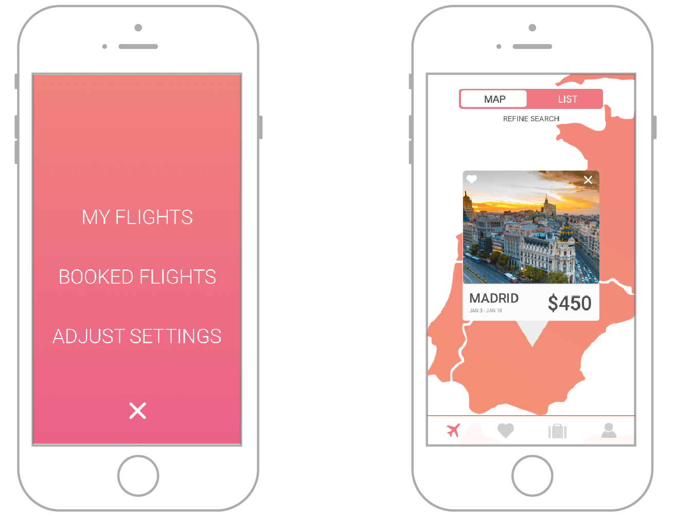
To make Goji stand out from other flight booking apps, I needed to make sure to make the flow as straightforward as possible. I organized the app into four main sections- explore, favorites, booked flights, and user profile. All four sections are accessible from almost every screen so as to allow for quick maneuvering around the app.
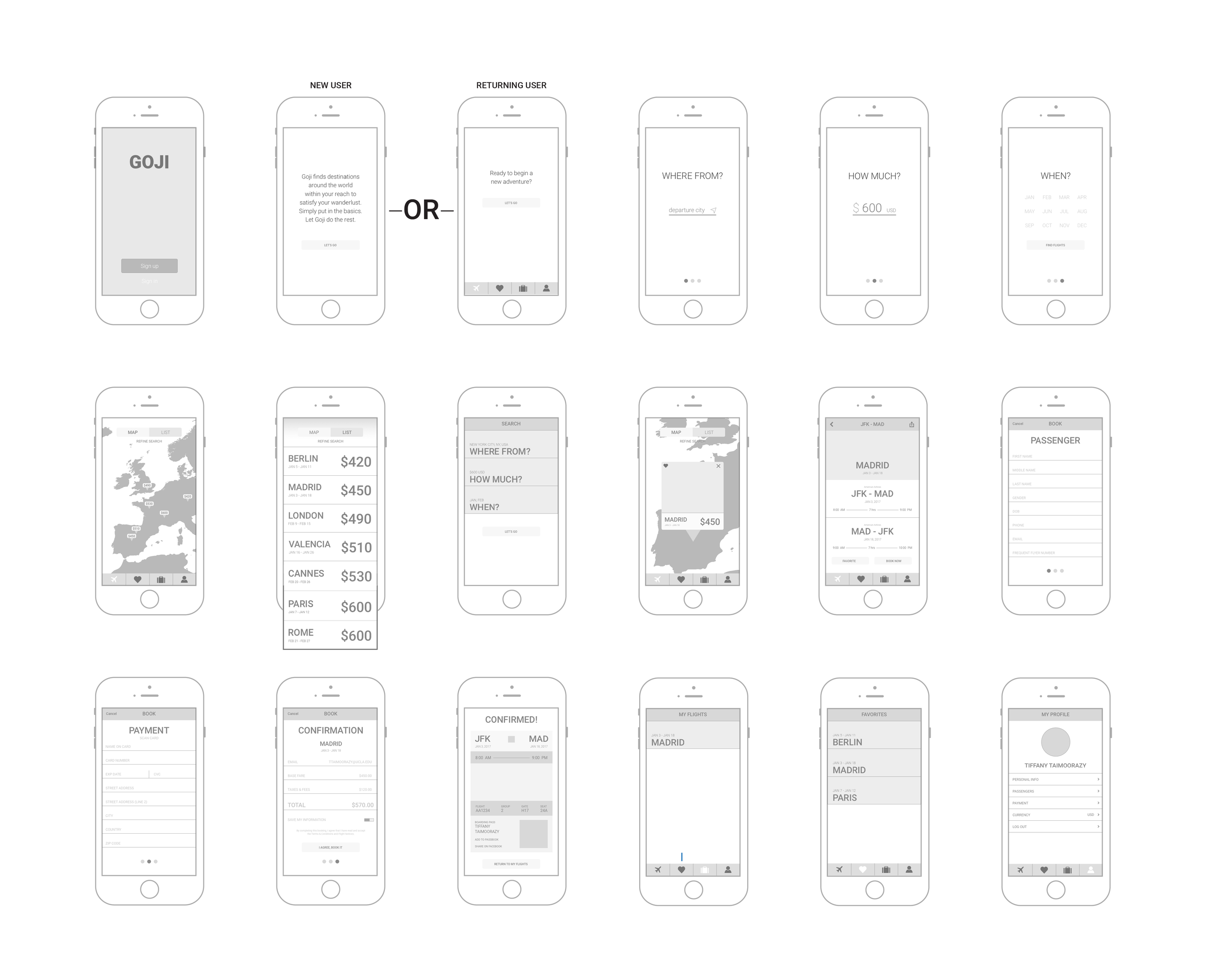
The three primary actions of Goji are searching for flights, booking flights, and refining the search criteria. The flows for each of these actions are shown below. Each flow was carefully designed and refined to be simple and effective while also staying playful.
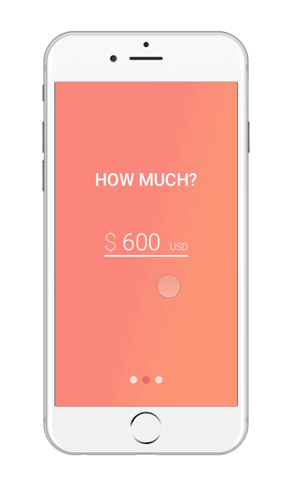
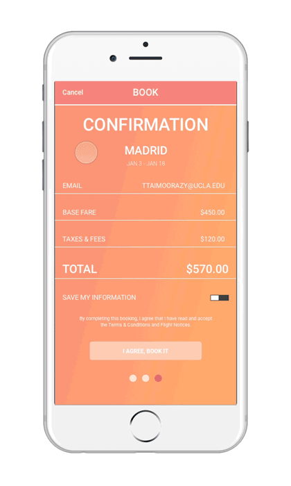
High-Fidelity Mockups
I wanted the final color scheme and overall design of Goji to be vibrant, playful, and modern. I used bright colors and gradients to make it look sleek but not flat. The pop-up cards on the map screen and booking confirmation screen also created depth and contributed to a more layered appearance. I countered the full-bleed gradient screens with white screens so as to not overwhelm the eyes.
Prototyping
I wanted the animations to look very sleek, but I also wanted them to be very lively and exciting. I looked forward to this part of the development the most because of my passion and experience with motion graphics. The prototypes were created in Principle.
Challenges
I had some difficulty creating a menu for Goji. In the first iteration, the menu was one button at the bottom of the explore page that would give access to the saved flights, booked flights, and search criteria adjustment pages. This design forced users to go back several screens to access the main menu again and proved to be very confusing and unnecessarily complicated. I replaced it with a classic tab bar at the bottom of the screen.
The original Goji iteration also had a fourth search criteria option- theme. This allowed users to choose vacation themes like beach, ski, romantic, urban, etc. I removed this option because it was too difficult to categorize destinations. Is Miami beachy, romantic, urban, or all of the above? One person many think of London as romantic but another may not. The theme option was too subjective to include in the final iteration. I also considered adding a search criteria option for number of passengers, but decided against it. Goji’s target audience is people in their early to mid-20s. These people don’t have families yet and even if they plan a vacation with their friends, they are usually buying plane tickets for themselves since many of them cannot afford to purchase multiple plane tickets at once.