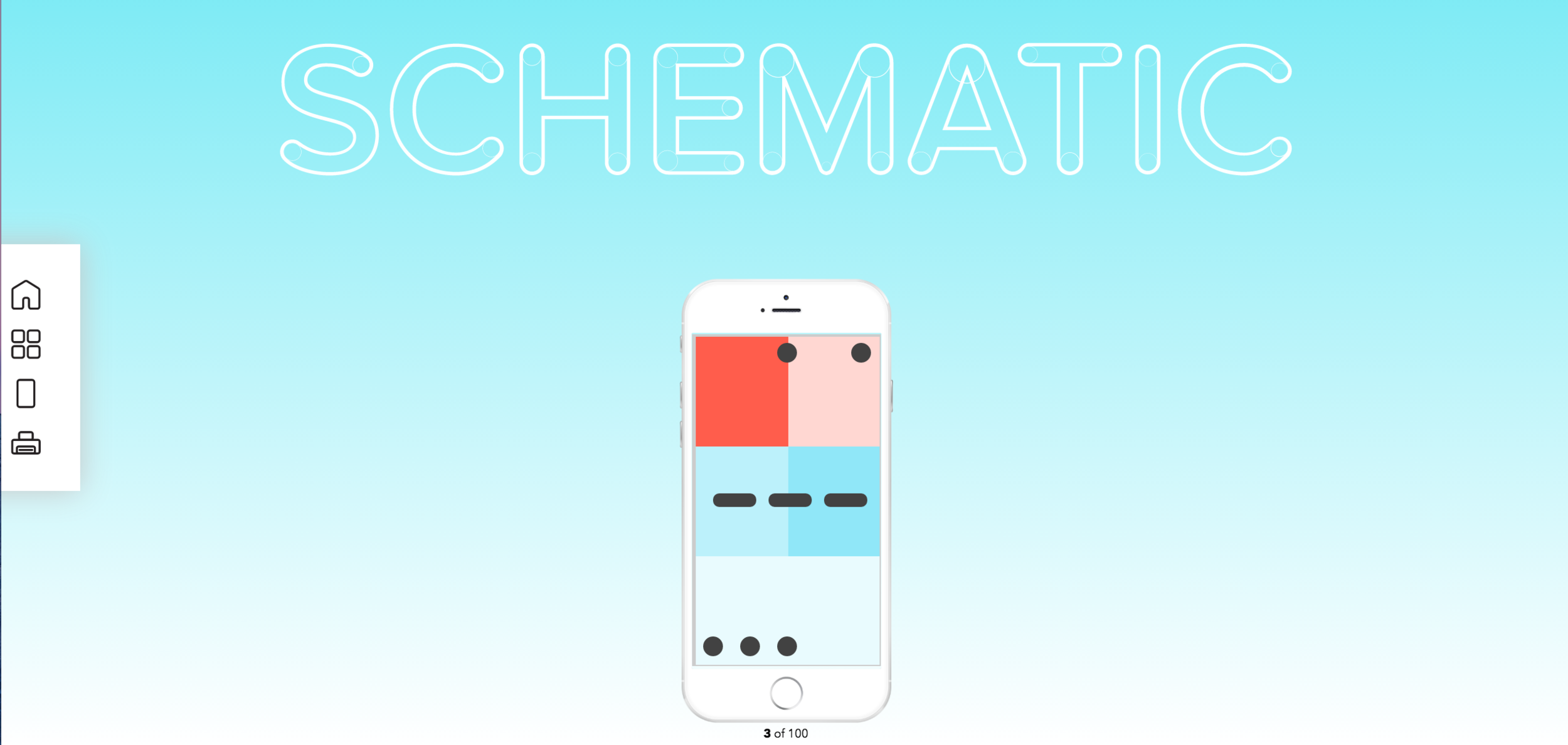
Schematic
Product Design, UI/UX Design
What is Schematic?
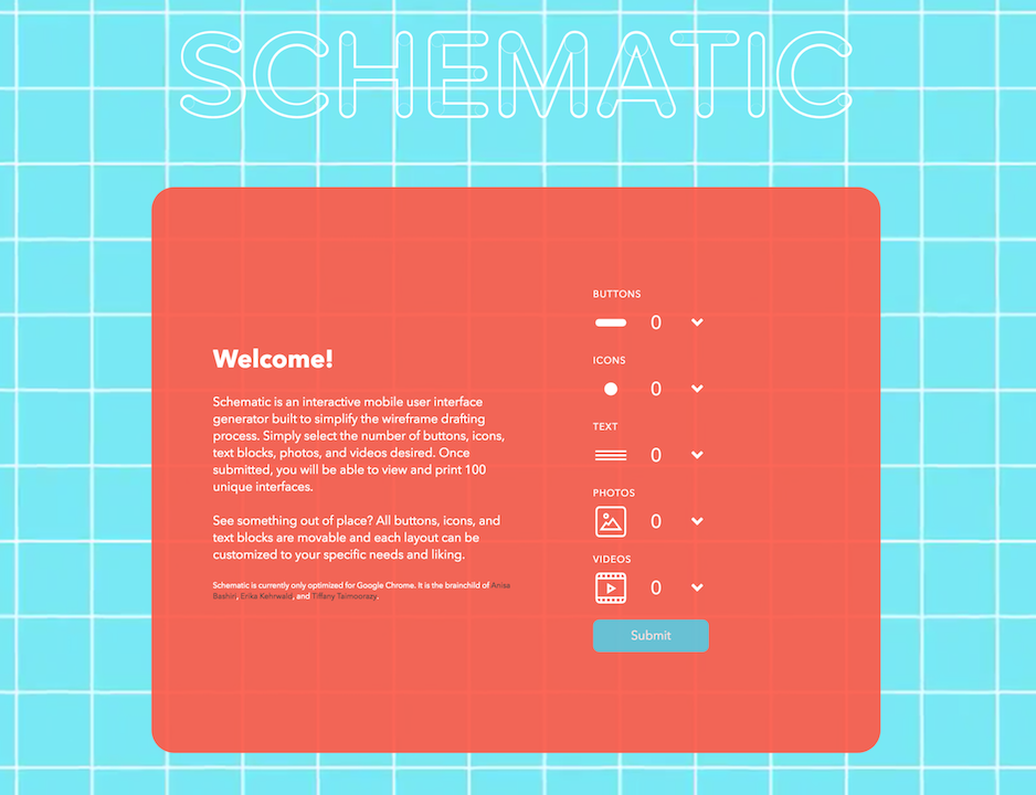
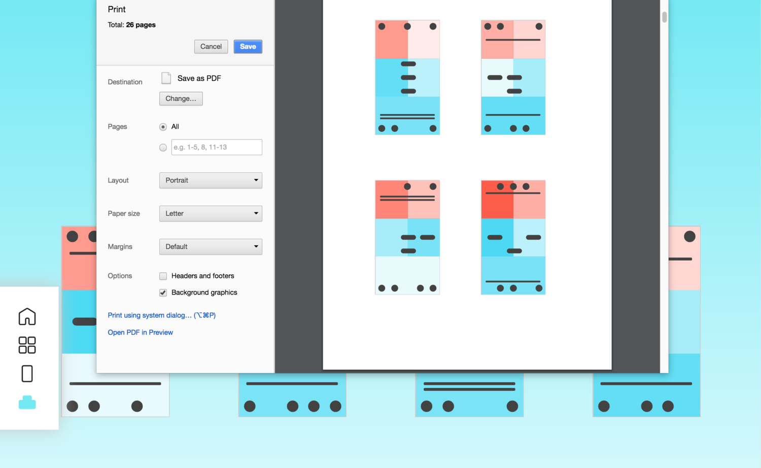
Schematic is an interactive user interface generator built to simplify the wireframe drafting process. The user selects the number of buttons, icons, text blocks, photos, and videos desired. Once submitted, the user will be able to view and print 100 unique interfaces. Currently, Schematic is only optimized for Google Chrome on desktop.
Team
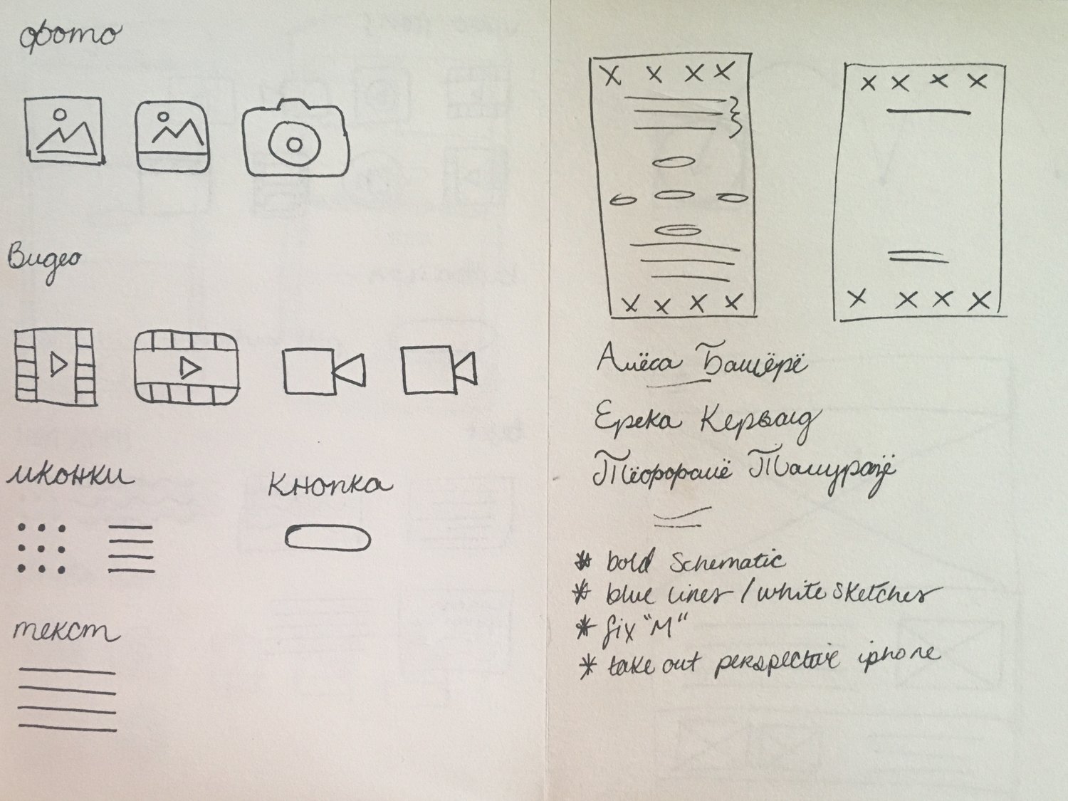
Schematic was built with Erika Kehrwald and Anisa Bashiri with additional support from Rishabh Aggarwal.
Problem
There are many prototyping tools for creating UI screens for mobile and web interfaces (including Sketch, Pixate, Invision, Adobe Experience Design, etc.). However, there is a gap in the market for one of the first steps for product designers: generating layouts. Almost everyone has experienced how difficult it is to write the introduction of an essay. Creating the initial sketches for a mobile layout can be just as difficult, especially when given little direction or when the final outcome is still ambiguous and yet to be decided. Product designers must organize information and make decisions about what to emphasize or where to give screen real estate to.
Solution
We sought to create a program for product designers that made this initial step easier. Designers would be able to input their content and have multiple wireframes generated for them. By showing them various options of what their layout could look like, they can already see what they like and don't like and have a sense of what their final layout should be.
Research
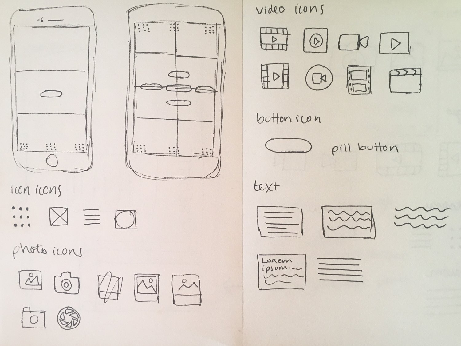
We started by surveying friends, colleagues, and fellow designers to see what type of content is necessary for an app layout. We included nine options to choose from: photos, videos, buttons, icons, text, logos, forms, search bars, commenting, and animation. In this case, buttons are defined as clickable objects that take you to a new page. Icons are defined as clickable objects which alter the current page or open a window on the current page.
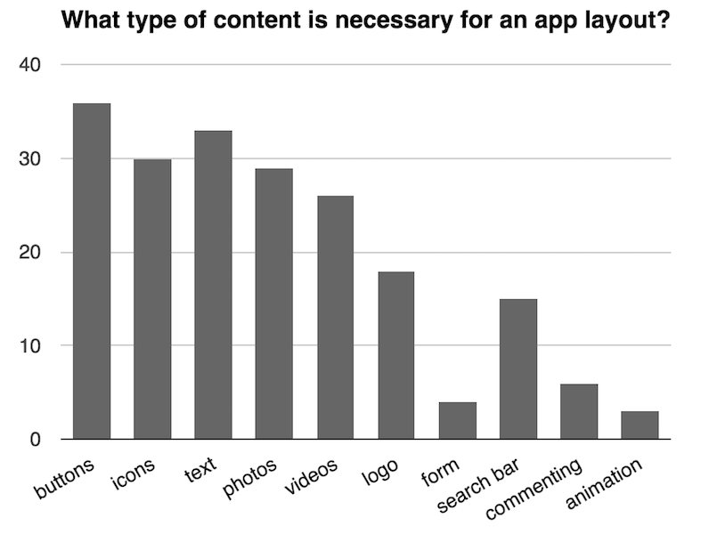
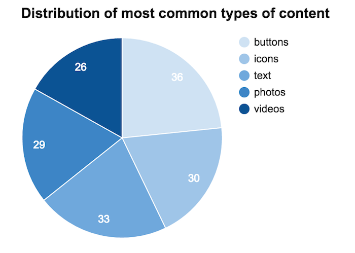
Out of the 40 people interviewed, we found that they mostly agreed that buttons and text should be a part of a layout. Icons, photos, and videos trailed closely behind with videos being the least necessary of the five, but all these options were within close range of each other. 18 people said logos should be a part of the layout, but since we limited ourselves to five types of content input for Schematic, it was not considered. Furthermore, a logo's usage can vary drastically from app to app, so its representation would have been difficult in our program. The least necessary type of content was the animation feature, which only received 3 votes. This is an understandable result, since animations can take longer to load and many animations in apps are mostly used for pages such as load screens.
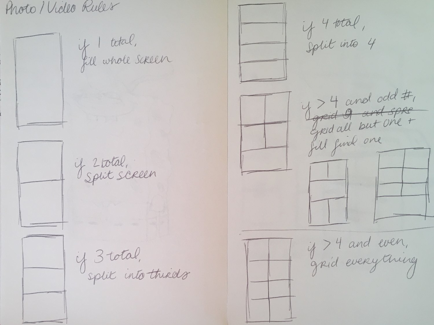
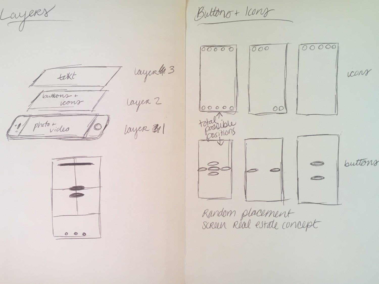
Program Design
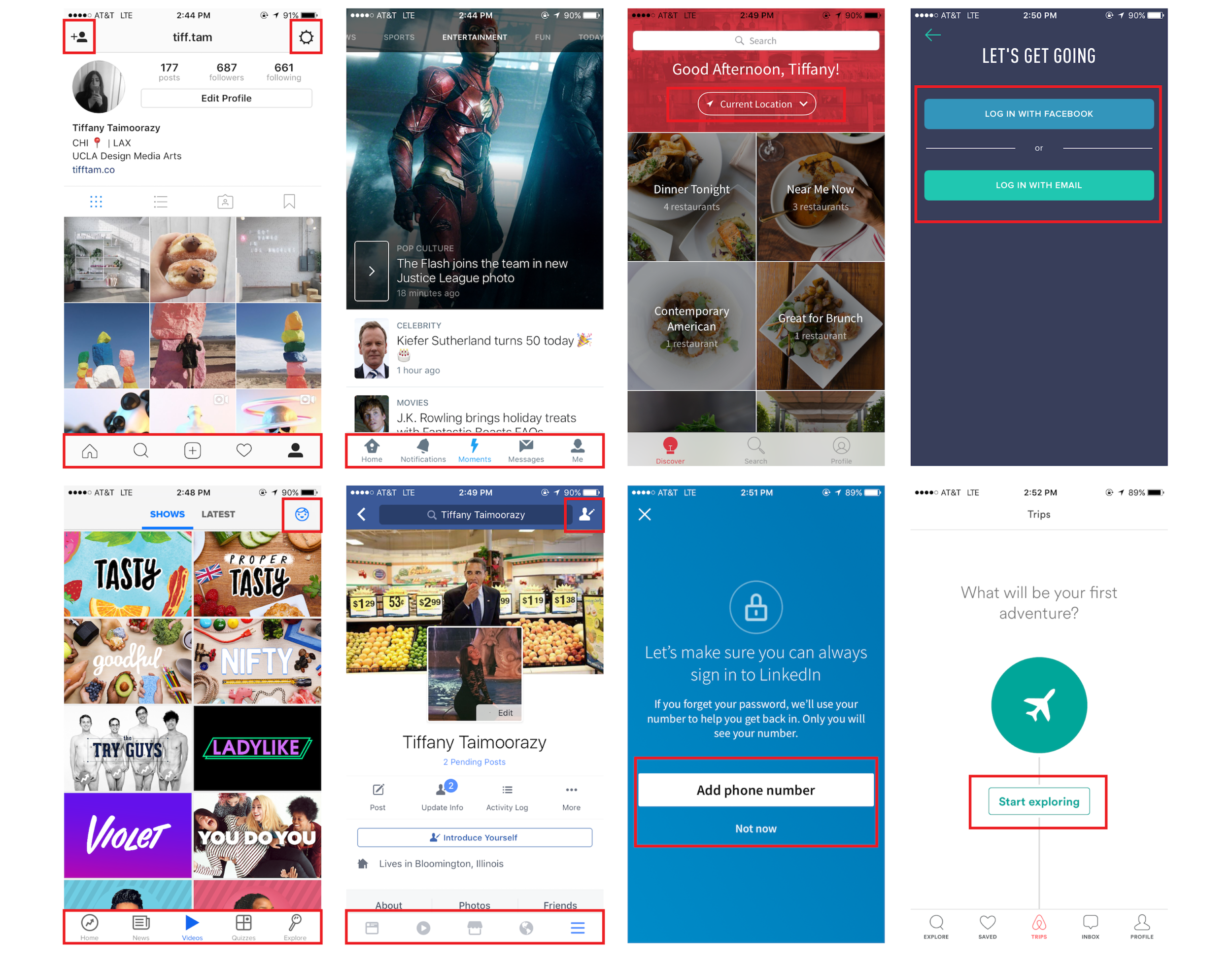
After deciding the types of input for our program, we had to define where they would go and how they would be organized when more content was added. We created a set of rules for each type of input that defined all possible areas they could be placed on a screen. Each type of input had its own unique set of rules since a photo cannot be treated the same way as a button. We treated photos and videos the same since they are usually used in similar contexts. After examining several existing apps, we decided to place buttons in the center of the screen and icons on the top and bottom of the screen. Apps like Instagram, Twitter, Buzzfeed, and Facebook all use icons on the top and bottom of screen and OpenTable, Airbnb, and general login or notification screens place buttons in the center of the screen.
The next problem we had to tackle was how to ensure that the buttons, icons, and text would appear above the photos and videos and not compete for screen real estate. We solved this problem by separating the content into layers. The bottom layer contains the photos and videos, the middle layer contains buttons and icons, and the text is on the top layer. This way, we could have our objects on top of each other without the program thinking that space on the screen has already been taken up by something else.
Styling
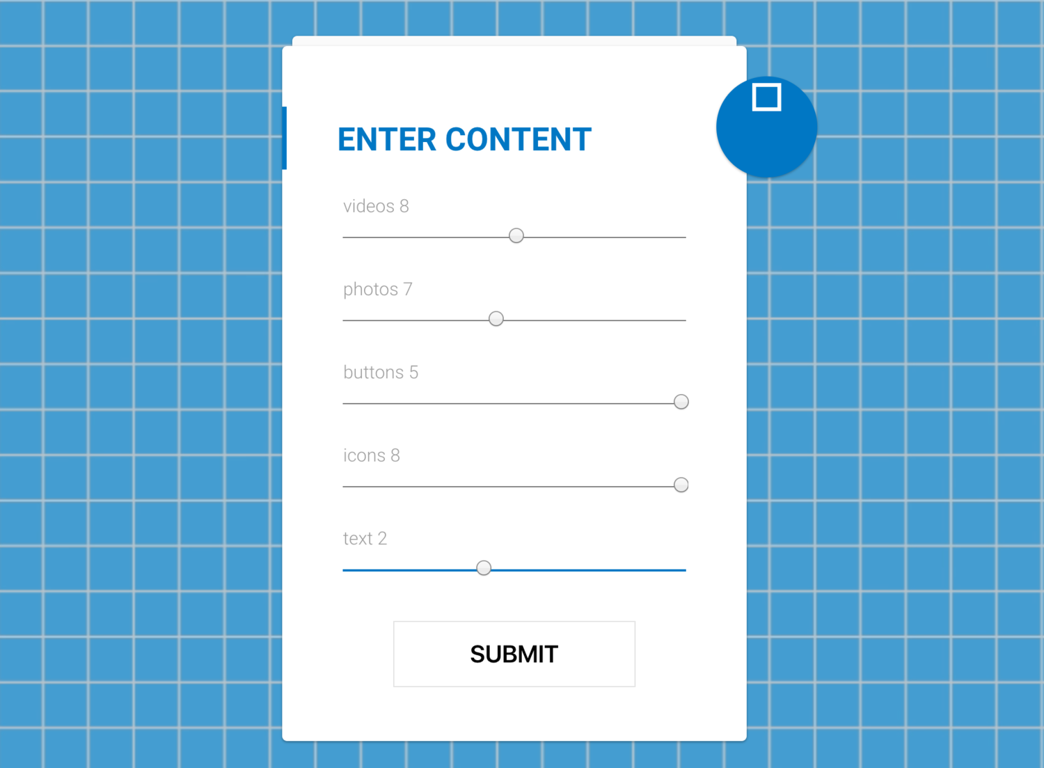
Our biggest problem when it came to styling was the form on the main page. Our original idea was to use sliders for each input, but we quickly realized that that type of form was not suited best for our project. Each slider's range would have been different (i.e., you can input up to 8 photos but only 5 buttons) so two sliders could be maxed out but represent completely different values. We switched to a drop down menu and immediately recognized the vast improvement. The overall layout of the home page became much neater and the form simply made much more sense.
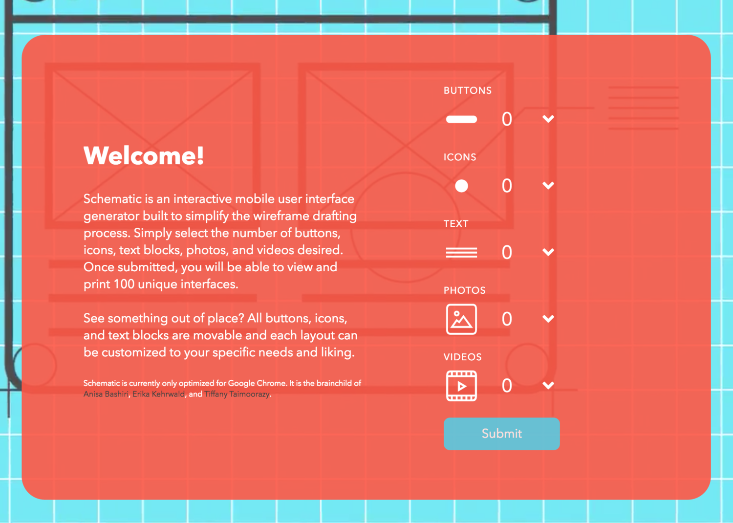
After getting the form's layout down, the next step was to style it. I created a series of thumbnails to represent each input. It was important to keep the thumbnails simple but understandable. I went through several iterations to get to the final set of thumbnails. The greatest difficulty in creating the thumbnails was creating the button and icon thumbnails. We decided to use a pill shape for our buttons since that shape has recently gained popularity with its use in apps such as Spotify and Airbnb. Although we initially wanted to use a hamburger icon for the icon thumbnail, we decided against it because it looked too much like a menu/index button and we wanted a more universal-looking thumbnail.
The final step to styling the home page was the color scheme and background video. We knew we wanted a blueprint-style background and decided to have a panning video as our background. The video would contain sketches, wireframes, and actual circuit schematics to keep with the wireframe-theme of our program. It was designed in Adobe Illustrator and composited in Adobe After Effects.
The color scheme of our video was originally very dark and basic. We wanted it to look professional but it instead ended up looking depressing. To change our color scheme, we not only looked at other apps but looked at them before and after rebranding. For example, although Instagram's new color scheme is much brighter and more colorful than their old one, it looks much more refined and professional. We decided to follow suit and brighten up Schematic's visual identity. We originally went with a bright blue and yellow color scheme, but we feared it associated us too much with our alma mater UCLA since it has the same color scheme. After doing further research, we decided on a vivid salmon color. We felt this bright color scheme also reflected the creativity we hope to inspire in designers when using Schematic.
Result Page
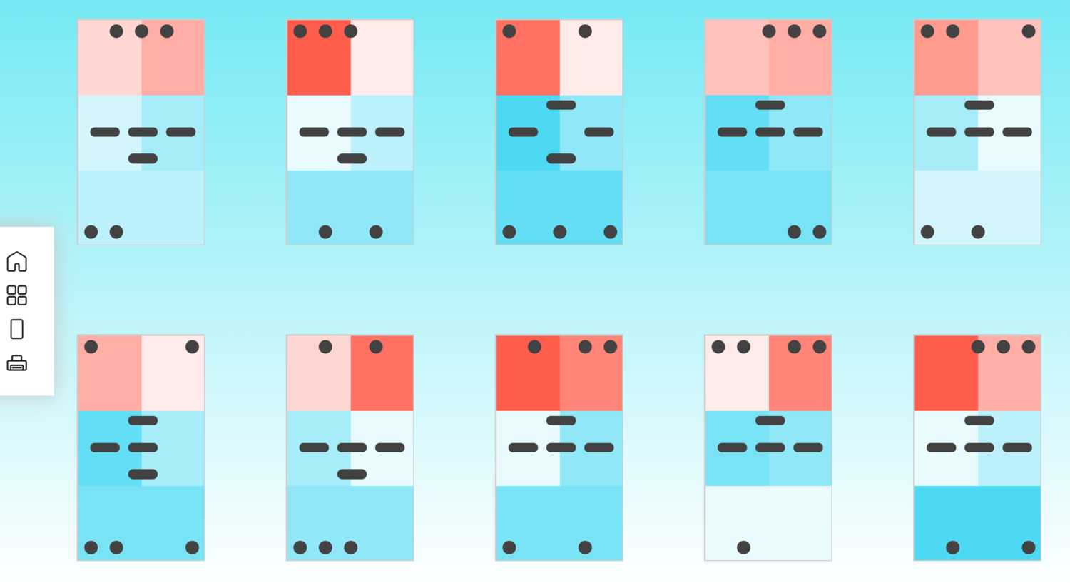
We wanted users to be able to view what the layout would look like if it were actually on a mobile device so we decided to have the resulting screens appear inside an iPhone. Users can scroll left and right to view the 100 printed layouts. We created a menu so users can choose to view the layouts in an iPhone or view all layouts at once. Furthermore, we did not want to limit the user to just 100 static layouts, so we decided to make the buttons, icons, and text blocks draggable. The user can rearrange the contents of a layout, scroll through a few more, and come back to their edited layout and see the program has remembered their changes. These results can all be printed and downloaded, as well.
Future Goals
- Optimize Schematic for all web browsers (currently only optimized for Google Chrome)
- Create mobile version or Android/Apple app
- Offer multiple choices of cell phones while in phone view on results page
- Option to export as a .sketch file